Back
A rewards card website delivers its benefits in a bento
CLient
engagement type
duration
status
Service

Client
About
FutureCard
Overview
Future had a compelling product and a clear mission, but the existing site struggled to establish content relevance. The initial site pushed shop and partner pages, but site visitors needed a clear pitch before diving into a catalogue of partners and shops.
We partnered with Future to rebuild the site around category-first experience paired with a fresh brand photography.
Our approach
We know that their target users are already in on the mission to spend consciously while supporting sustainability. The value that was buried was in high cashback and rewards from spend categories, so we surfaced them.
A category-first architecture
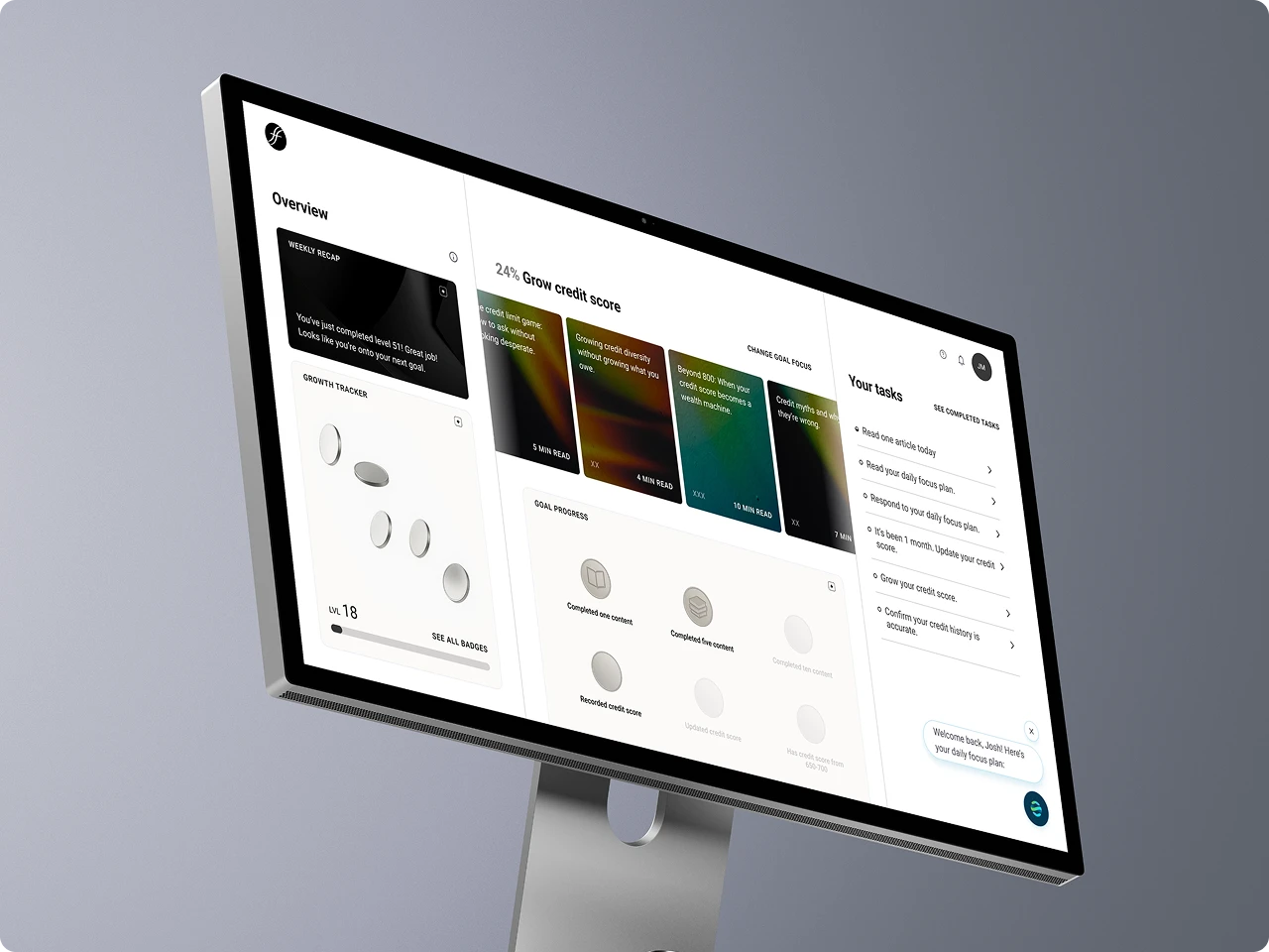
We introduced their highest-earning, most impactful categories like public transit, groceries, energy bills, etc. right on the home page. Each featured category then leads into its own dedicated page, where the benefits are broken down in greater detail. This opens up more paths for content discovery, letting visitors engage based on what interests them. The result is a less prescriptive journey that lowers the friction of signing up.
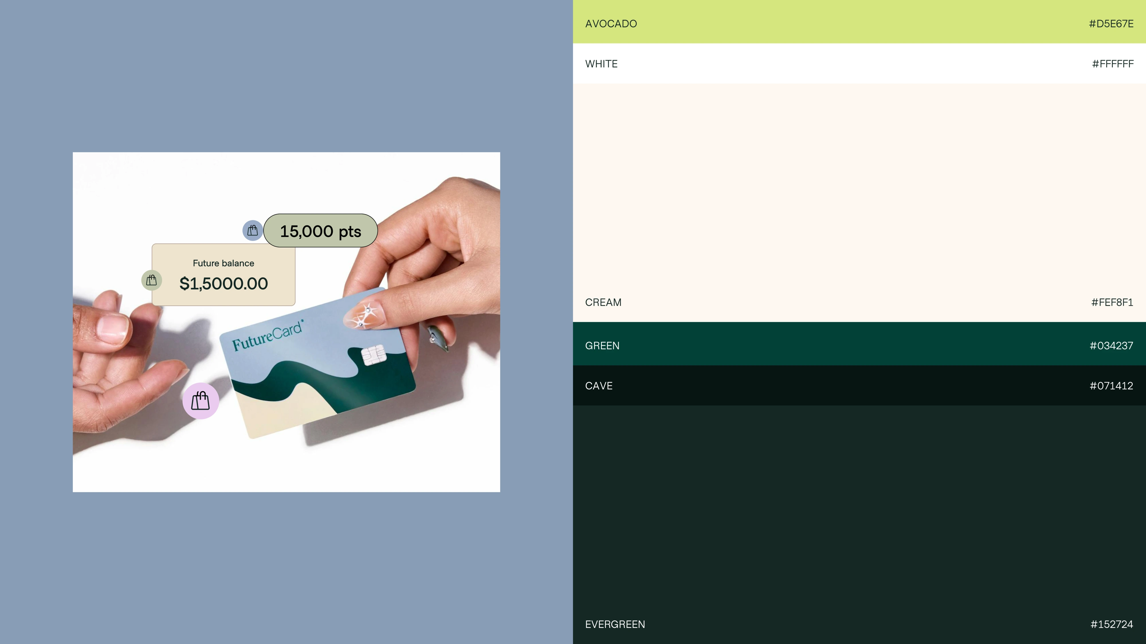
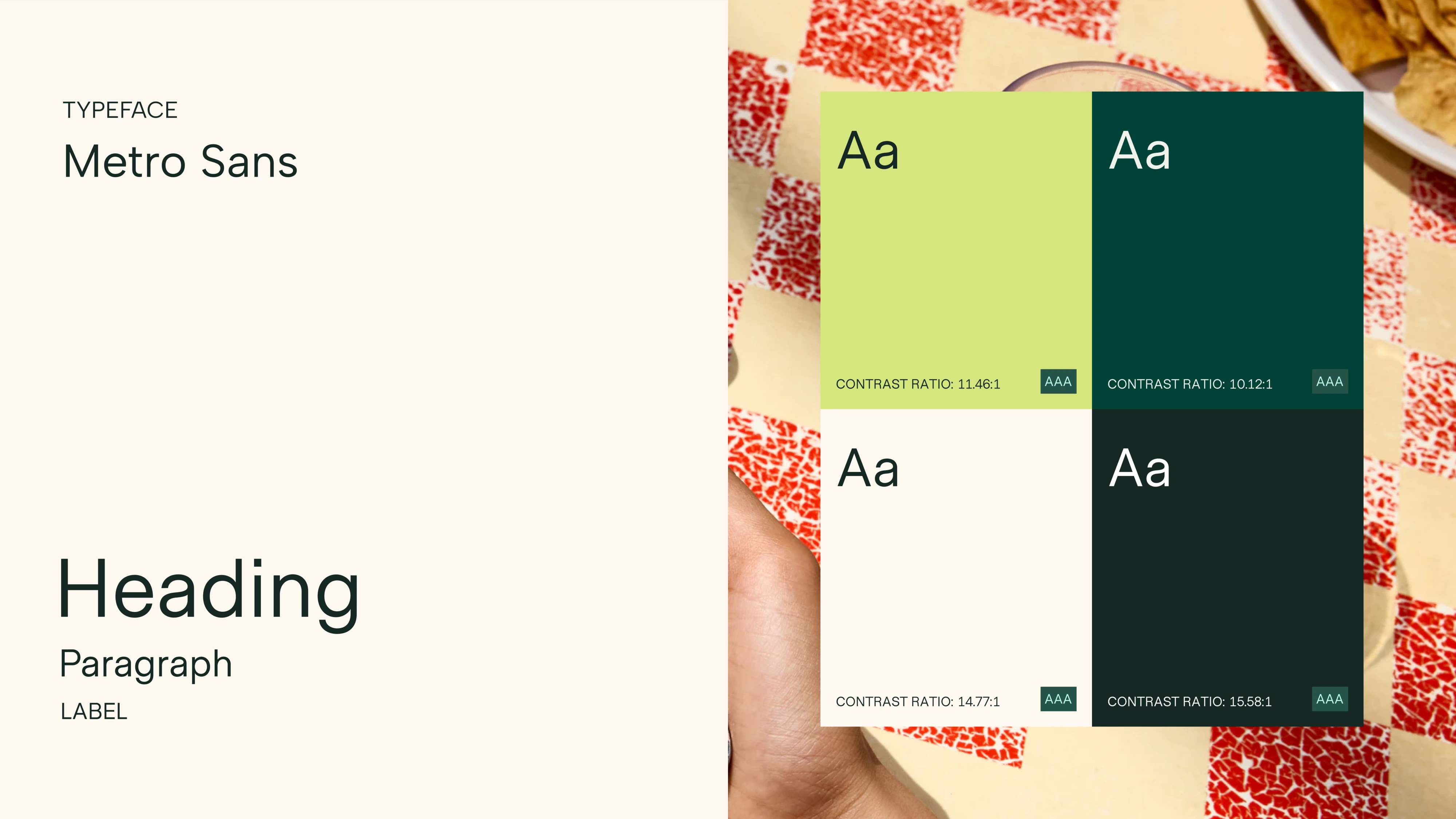
A brand-forward identity, built on a bento system
For the site design, we leaned into a bento system: a modular grid of framed tiles that lets several features share the page without competing for attention. The bento approach kept the visual hierarchy organized while carving out deliberate space for bold photography, illustration, and messaging. This approach gave the site a rich and expressive feel without ever looking crowded.
Conclusion
The redesigned Future site establishes its relevance to future users with a clear pitch: Spend consciously and get rewarded. The category-first approach makes the value unmistakable from the beginning. The modular design language carries the visual identity and messaging throughout the sign up journey.







.svg)