work
Behind the scenes of our partnerships and projects
.png)
Client-Partner feature
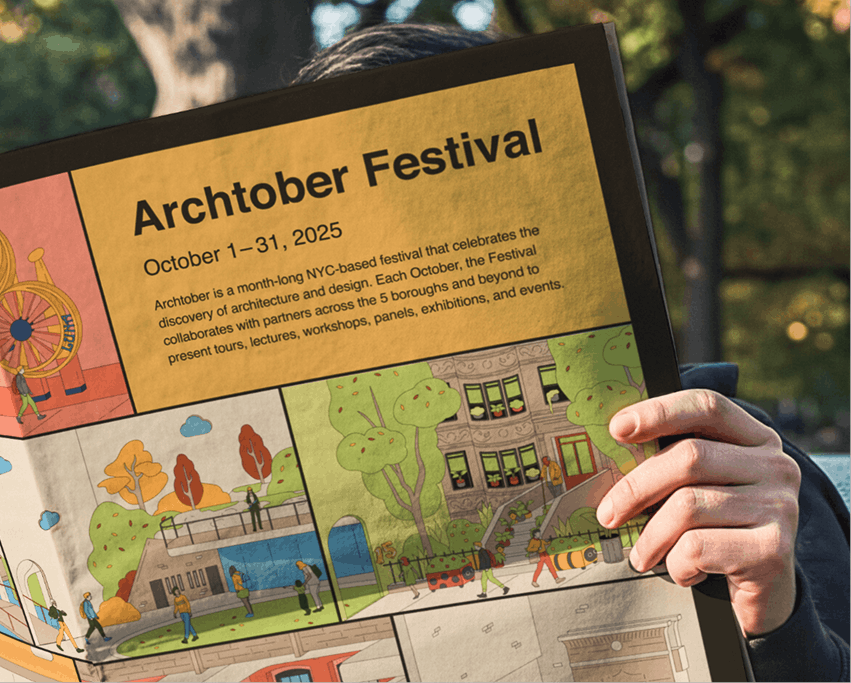
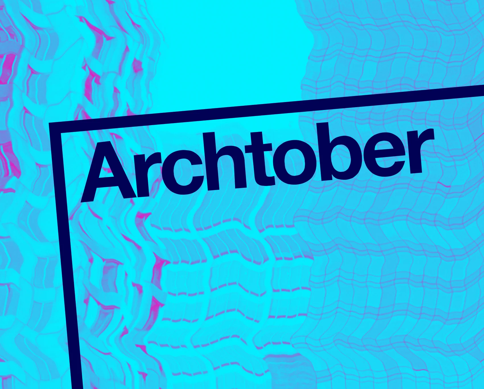
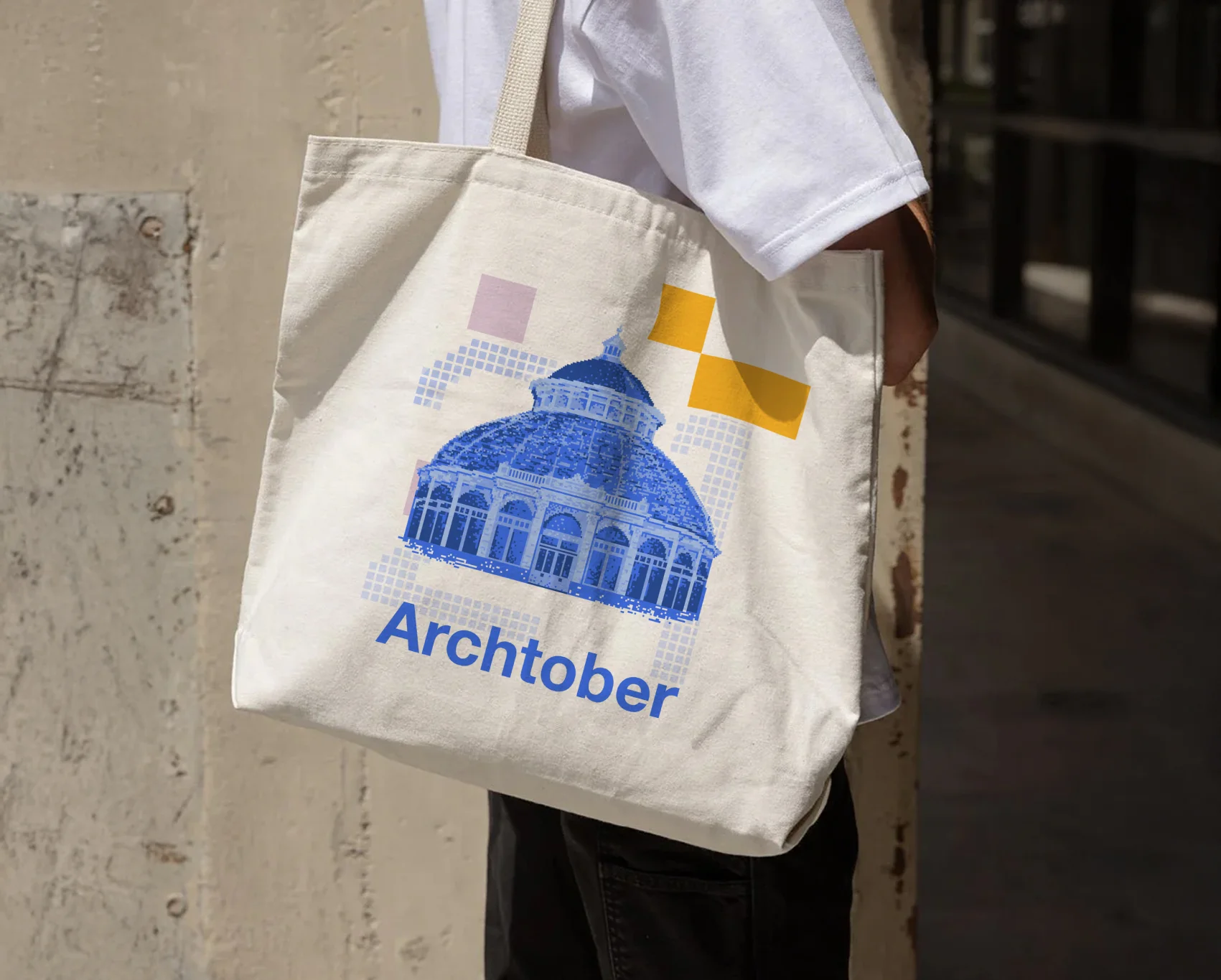
A 7 year partnership with Center for Architecture
Since 2020, Greater has partnered with Center for Architecture to design, launch, and manage the physical collateral and digital experiences of their annual festival, Archtober. We've built new systems and operations, with our work occasionally extending beyond the festival to support in other initiatives. Please see the archive of our work below.
+114.2%
Growth in site users
+54.8%
Growth in organic search traffic
+159.8%
Growth in organic social traffic
2023-2024 YOY: Growth attributed to our work launching a new year-round website that enabled ongoing editorial content. This approach is aligned with our position that companies need to act like a media company for resilience and longevity.


Make
GOOD
Trouble
Make
GOOD
Trouble
Make
GOOD
Trouble
All Work

.webp)
.jpg)
Filter by type
Filter by type
Jan 01, 2021
Thank you! Your submission has been received!
Oops! Something went wrong while submitting the form.