Your search for a design partner ends here.
Greater builds the brand and experience systems behind campaigns, content, and interfaces. Adaptable enough for what's next, structured enough to free your teams from the scramble.
TAG
Webflow Enterprise Partner
TAG
Dribbble select agency
TAG
AIRDROPS CERTIFIED
TAG
Claude code agency
Your hunt for a design partner ends here.
Greater builds the brand and experience systems behind campaigns, content, and interfaces. Adaptable enough for what's next, structured enough to free your teams from the scramble.
TAG
Webflow Enterprise Partner
TAG
Dribbble select agency
TAG
AIRDROPS CERTIFIED
TAG
Claude code agency
$800M+
raised by our client partners
10+
years growing brands
48+
months of median partnership
1000s
of collaborative design projects
World moving too fast? Uncertain of next steps?
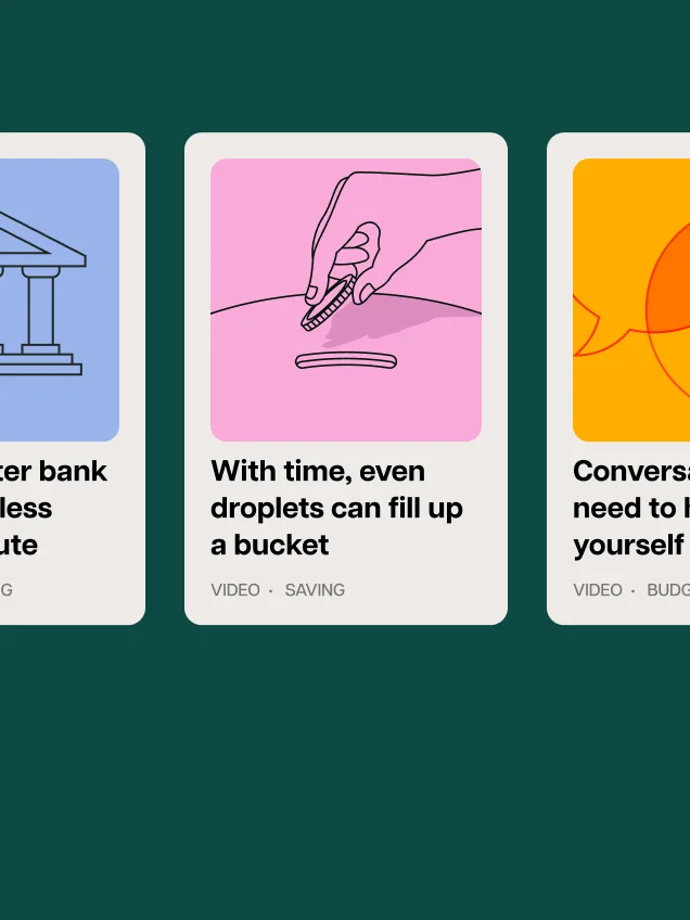
Ideas and research from our team so you can position yourself as the most future-forward team member in the meeting room.
.webp)
.jpg)
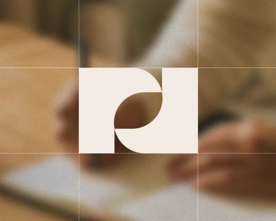
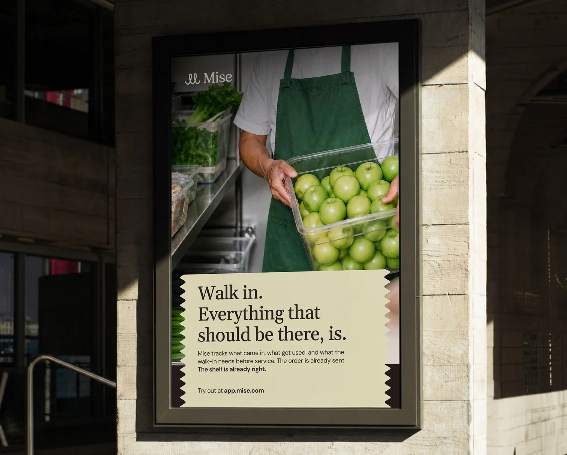
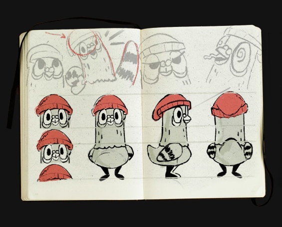
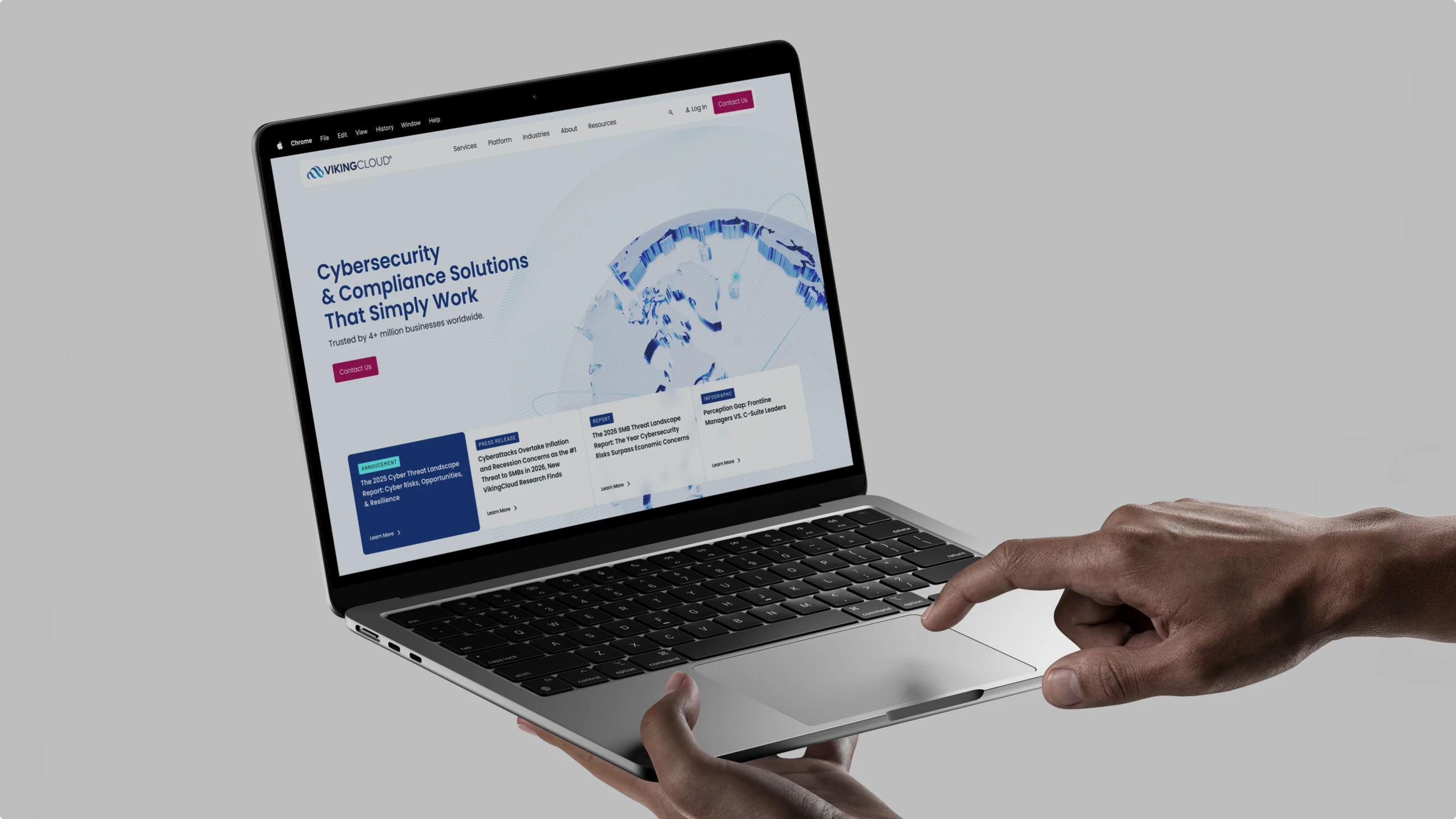
Strategic design partnership that evolves with you
Specialized creative services to help you at any stage. From first sprint to fourth year, we build lasting partnerships that transform ambitious visions into market reality.

MVB

Brand Transformation
Embedded Brand Team
Content OS
Promotional Videos
Embedded Content Team
.jpg)
Site Migration
Component Libraries
Custom Site
MVP
Transformation Sprint
Embedded Product Team


Rise above into forever.
Let's talk about your next project.