Back
Designing a Tea Package with ultimate shelf appeal
CLient

engagement type
duration
status
Service

Client
About
FirsdTea
The Challenge
FirsdTea needed packaging for their line of herbal teas that would stand out visually on crowded supermarket shelves and reflect the unique character of each flavor.
The Scope
The goal was to create packaging that not only looked beautiful on its own, but when placed on a shelf together told a larger story.
The Results
This design approach not only differentiated each flavor through its own unique visual story but also unified the brand in a beautiful and harmonious way.
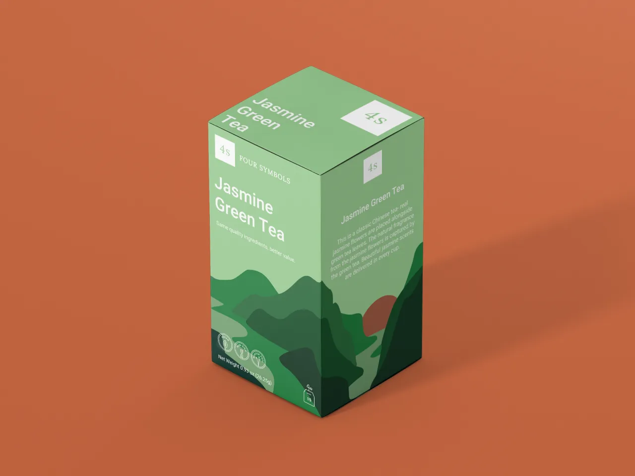
We designed packaging as a continuous fluid illustration, where each flavor's packaging aligned seamlessly with the others.

This way, the packaging design created a cohesive landscape on the shelf.
Each flavor was represented by a distinct color and the front of the box was designed to visually represent each distinct tea. For example, "Sleepy Tea" featured jagged mountains under moonlight, while "Jasmine Green Tea" was depicted by a lush riverbank, evoking a sense of tranquility and freshness.


.png)