Back
Designing an experience for two distinct perspectives
CLient
engagement type
duration
status
Service
Client
About
Novellia
Overview
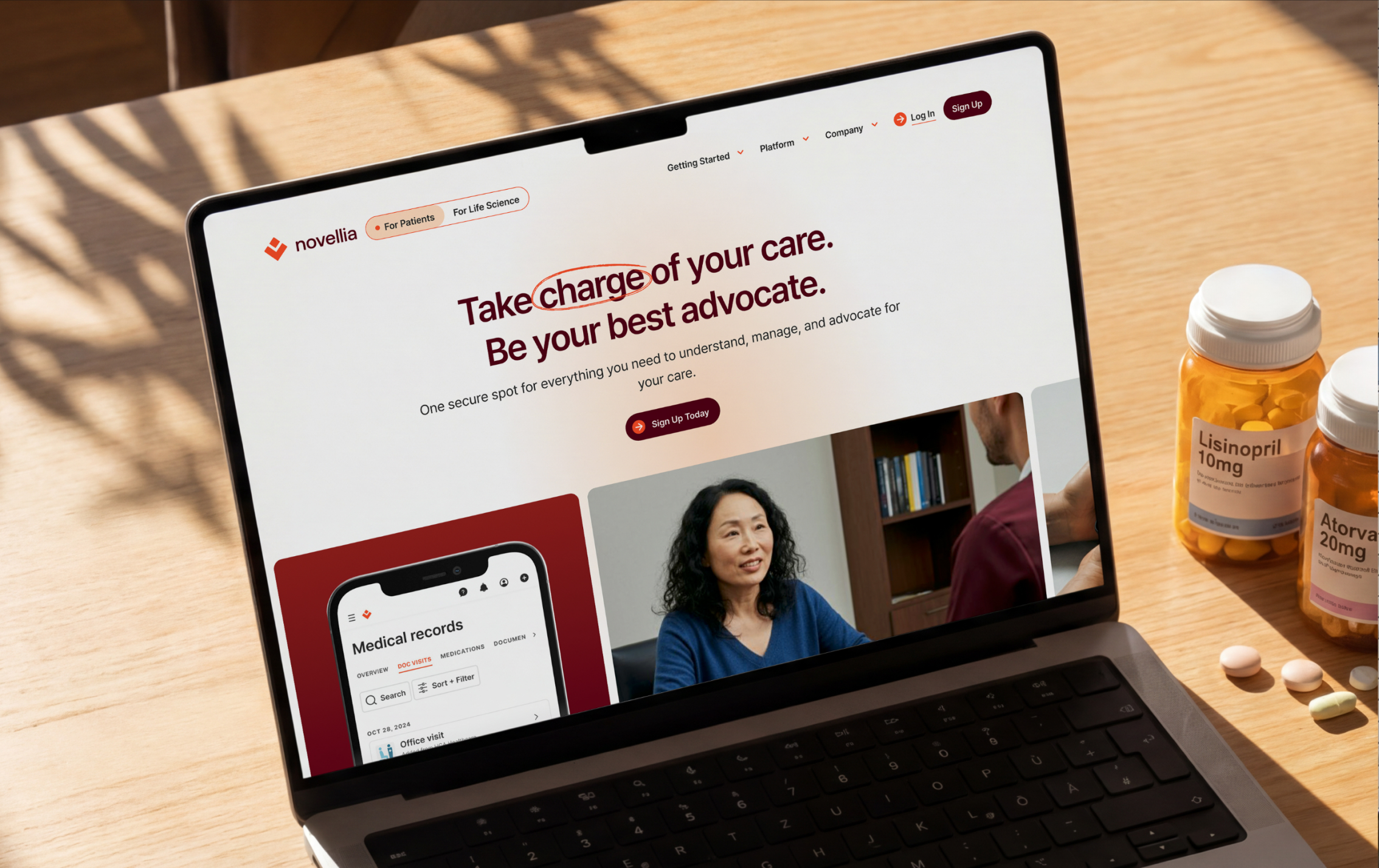
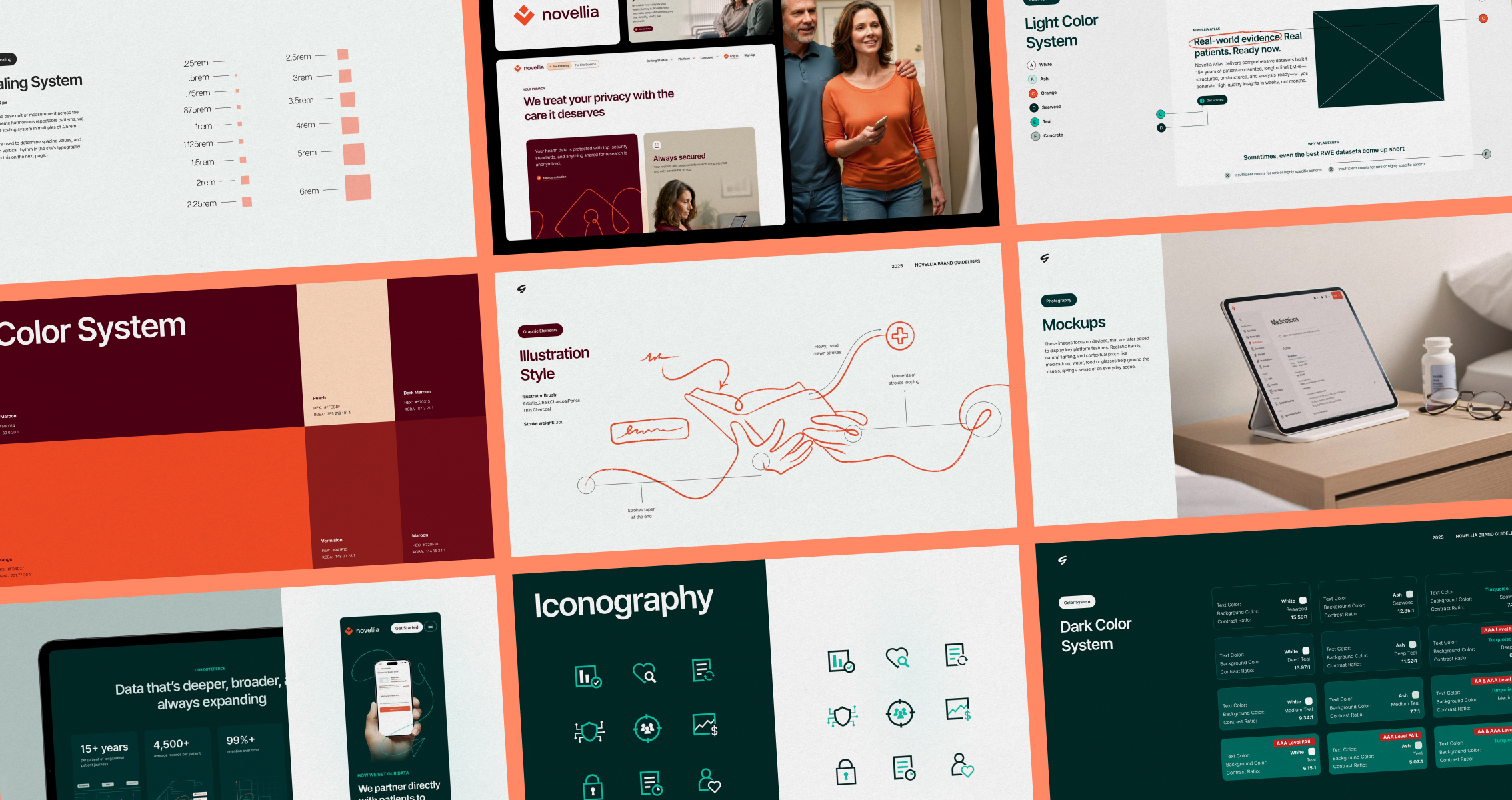
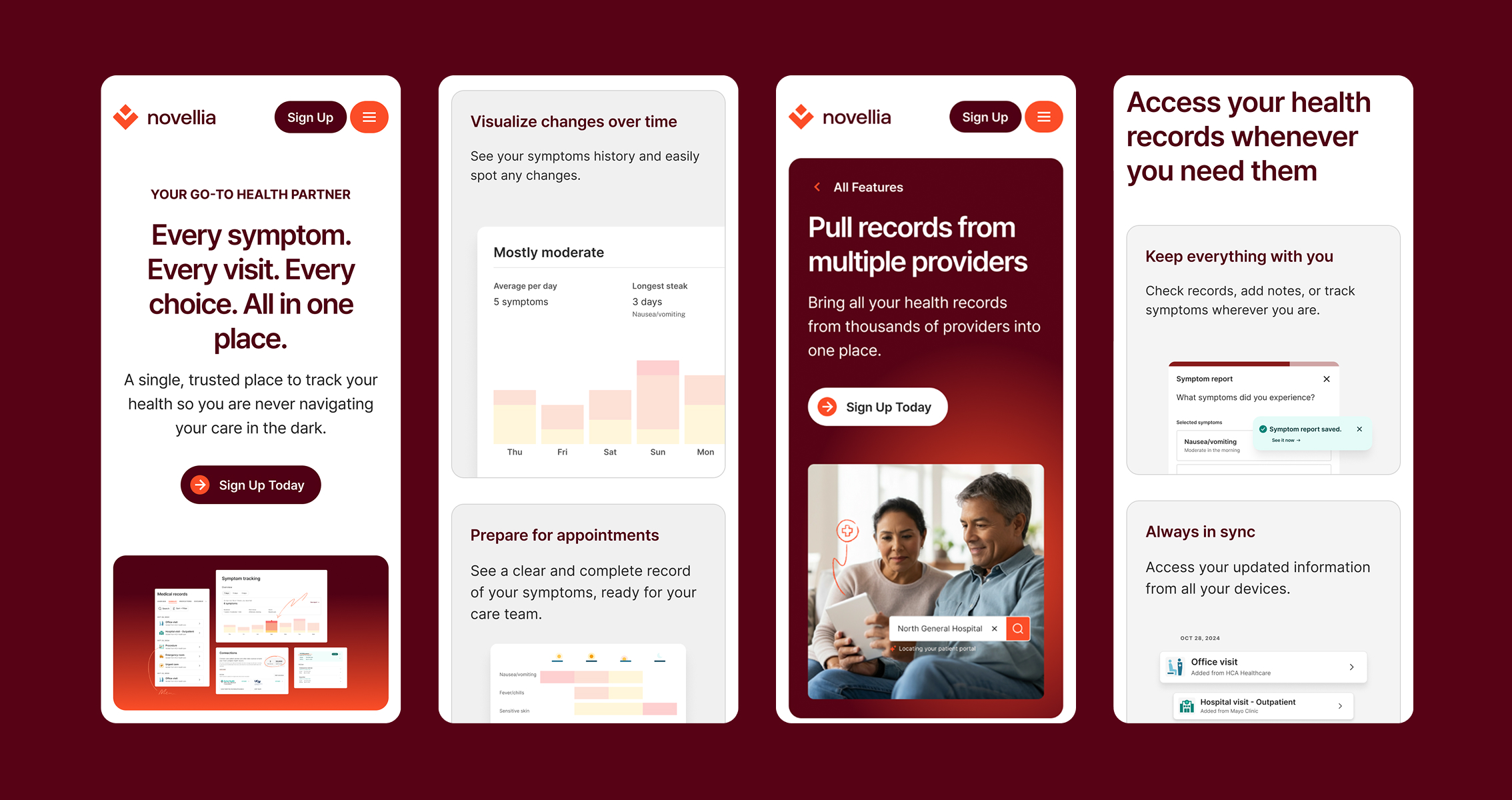
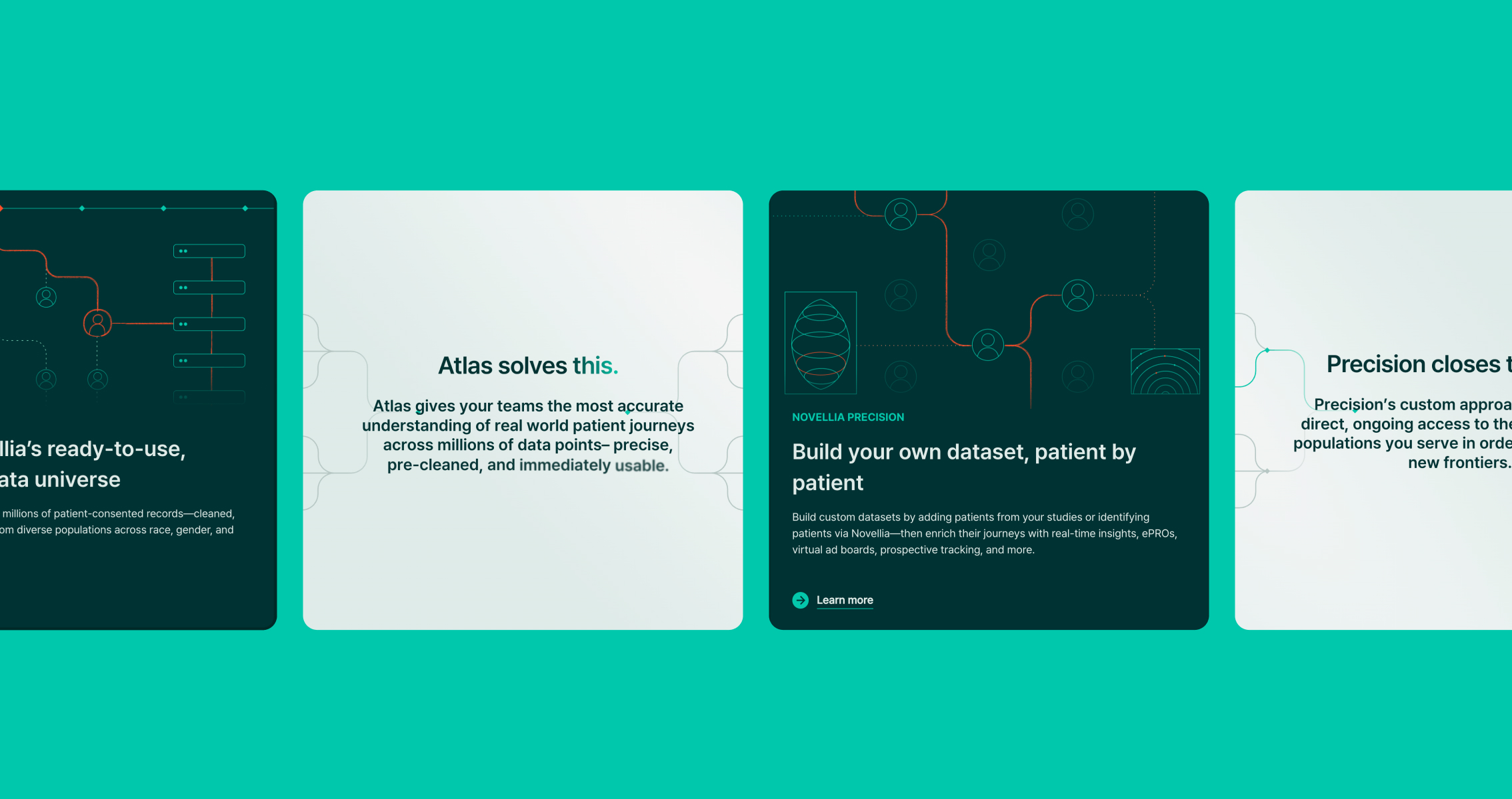
Novellia came to us with a visual foundation, but needed help bringing it to life for two distinct audiences: patients and life sciences. Each audience needed distict messaging, color usage, photography, and illustration, but still needed to feel like one cohesive brand. We used a dual-system approach anchored by color: warm orange for patients, clinical teal for life sciences. For patients, we leaned into the human side of navigating a health journey. Inspired by hand-drawn notes and margin doodles, we created single-line illustrations full of movement and expression. Photography captured authentic moments with empathy: patients at home, with loved ones, living beyond their diagnosis. On the life sciences side, illustrations shifted to a data-driven, infographic style, but we kept the human touch alive with small orange annotations and scribbles marking up charts and data. The result, two experiences coexisting on one site without feeling fragmented.


.jpg)