Back
This dashboard turns financial wellness into a game worth playing
CLient
engagement type
duration
status
Service
Client
About
Financial Finesse
Overview
Financial Finesse worked with Greater to redesign their product dashboard. We ventured into three levels of exploration:
- minor improvements to the existing user journey and UI
- design system and user journey refresh
- a reimagining of the entire experience to inspire their internal team with a new direction
The problem: users were unsure where to start, content was hard to find, and the platform's biggest asset, a robust library of financial wellness content, was buried inside a layout where elements competed for attention. Sustaining engagement after completing an initial assessment was also a challenge. Users would usually begin on level 1 where they see negative indicators that leave them demotivated.
Financial Finesse also wanted to reposition. The current aesthetic felt dated next to competitors, and the dashboard no longer reflected the sophistication of the coaching and content behind it.
Our approach
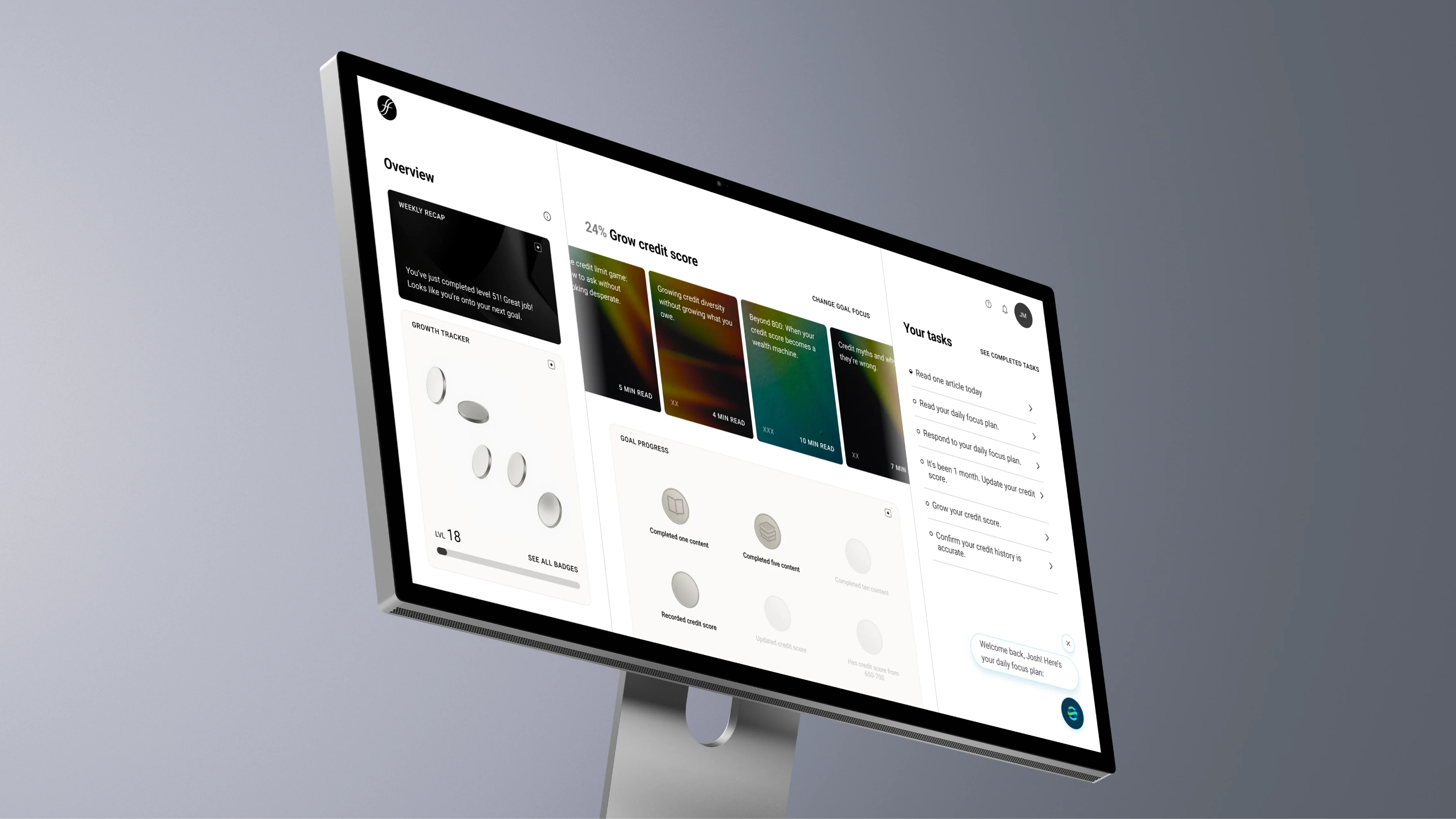
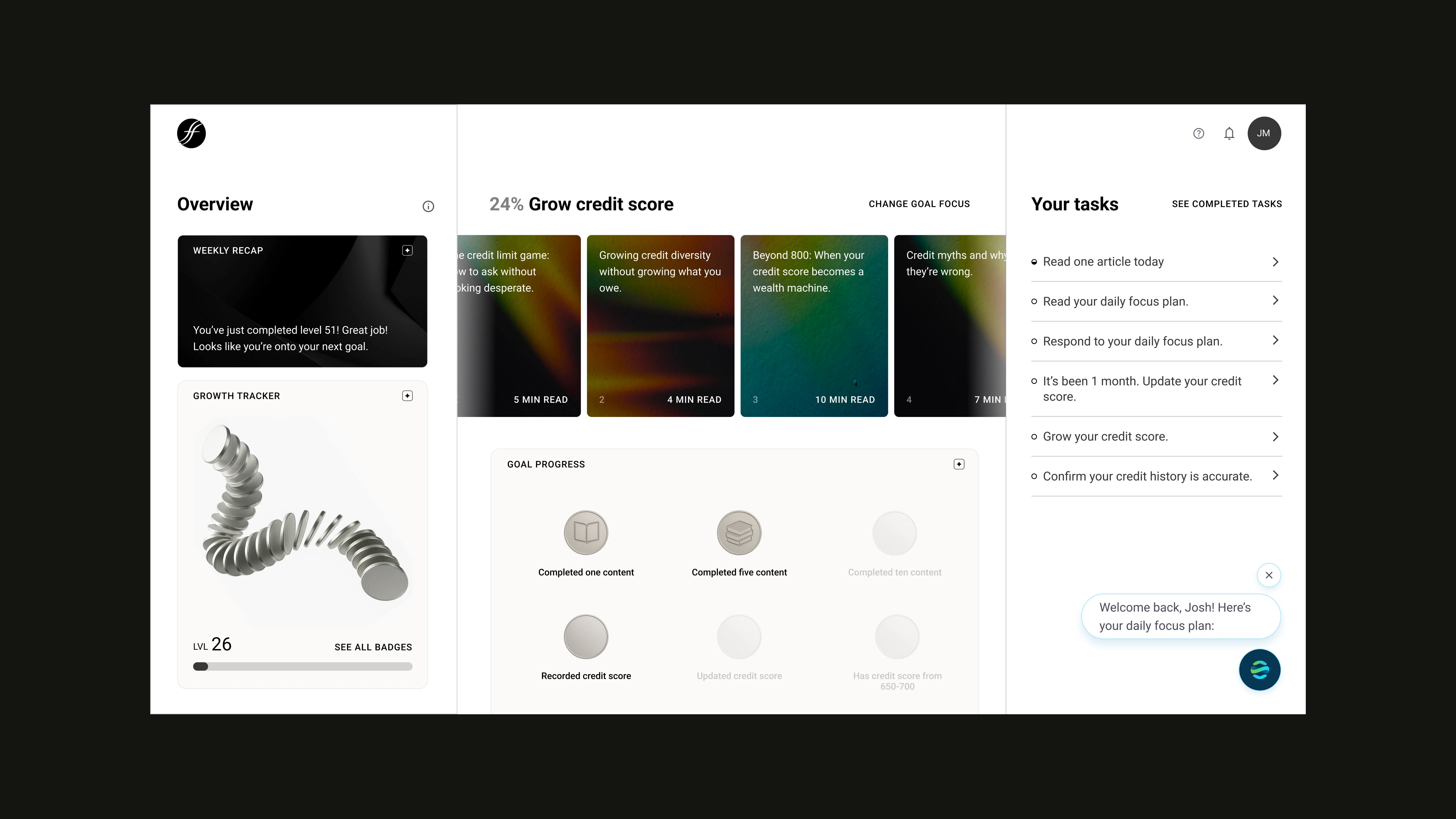
Improving financial wellness is incremental: the wins are small, and the regular effort could always be side-tracked by real life. We redesigned the dashboard experience to have a more optimistic, and sustainable approach by turning leaning into gamification. We introduced a a progression system where every action moves the user forward.
A cycle that rewards small wins
We structured the experience as a continuous cycle. Users start with an assessment that sets their level, complete tasks to earn experience, and level up to unlock new content that feeds the next round of tasks. Each completed task earns experience, experience accumulates into levels, and levels unlock new content and skills.
Users can pursue focused tracks tied to specific skills like planning for retirement or saving for a home. They earn badges as they complete them.
The reframe makes content discovery a natural byproduct of progression.
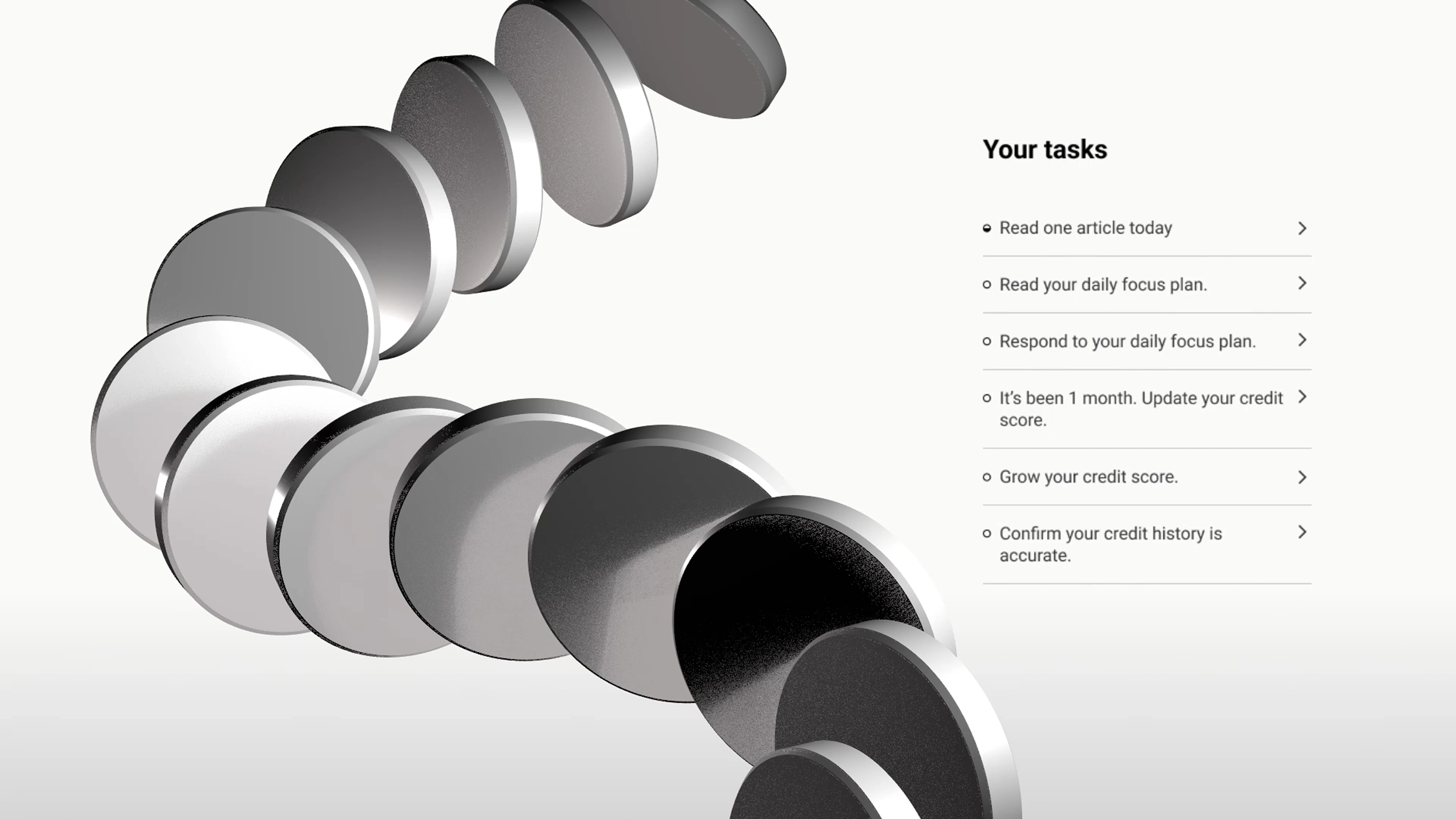
A visual language built around growth
The visual system is anchored in a core motif: the coin. Coins represent abundance, accumulation, and growth. As key visuals, they do multiple jobs across the product. They're earned as experience, they accumulate on the dashboard as 3D objects that visibly grow with the user's progress, and they serve as the base form for badges, which embed symbols representing each skill earned.
The colors used in the UI moved to neutral tones, removing the negative color associations of the previous system and giving the coin graphics room to carry the energy of the interface. The result is an aesthetic that reads as sophisticated, optimistic, industry-aligned, and reflects the essence and quality of Financial Finesse's coaching.
Conclusion
With the redesigned dashboard, users get a more personalized experience tied to their actual starting point, a clearer path through the content library, and a visual system that makes progress feel earned rather than assigned. For Financial Finesse, it's a dashboard that finally matches the ambition of the product behind it.


.gif)