Back
Designing a Bauhaus-inspired site that stepped outside the box
CLient

engagement type
duration
status
Service
.jpg)
Client
About
1014
The challenge
The 1014 website was in dire need of a facelift. The site not only outgrew its Squarespace home but felt outdated in its visual design. The home page boasted a high bounce rate that 1014 attributed to its lack of clarity and visual monotony. As a cultural institution with diverse, dynamic content and events, 1014 was eager to have a website that reflected their fresh, colorful personality.
Expanding on the brand
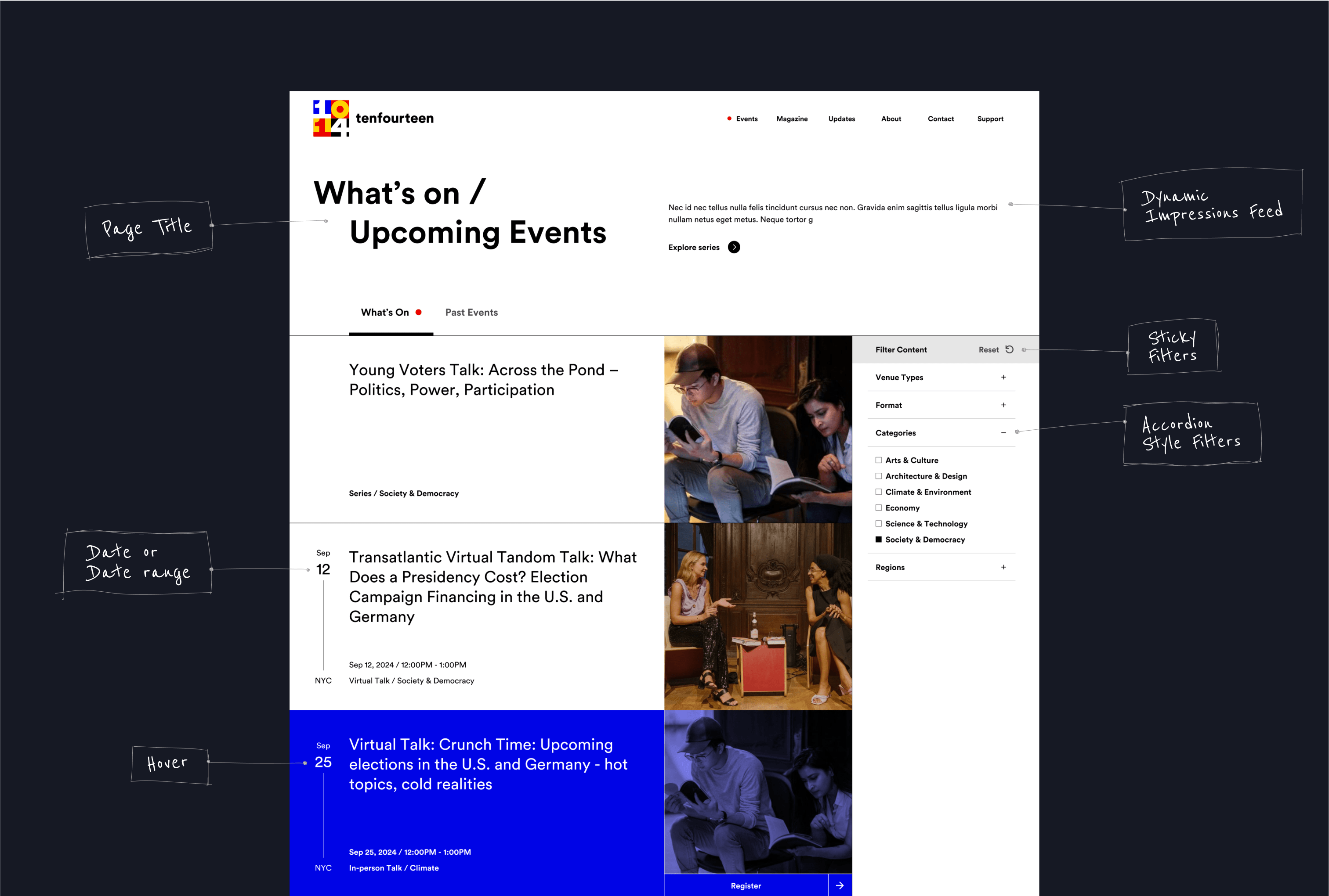
The inspiration for the sites ui was grounded in their bauhaus logo and vibrant primary color palette. Leaning into the use of the grid and geometric shapes, we built site layouts that that felt reminicent of the print & art of the time while still feeling fresh and dynamic. We made use of hover effects & animations to help further drive home the Bauhaus inspiration.
Reorganizing the site architecture
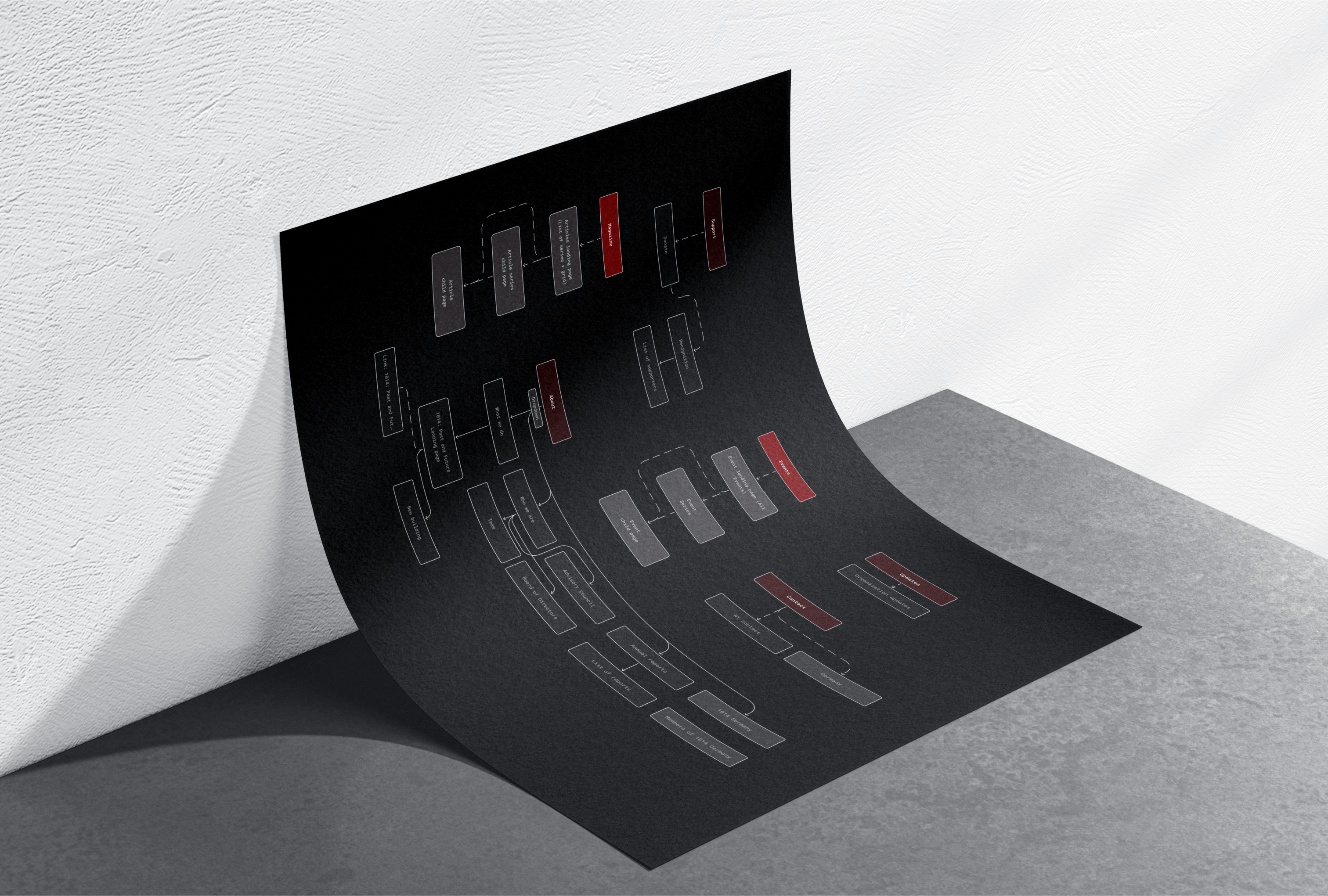
Our approach began by rethinking the Information Architecture. Originally, the site grouped events and content (such as articles, videos, and podcasts) under the same broad category of "Series," which often left users confused about where to navigate.
With a focus on the user journey, we separated content into two distinct sections of the site: Events and Magazine. Under Events, a user can now discover talks, concerts, exhibitions, and more by a calendar list of everything on now or by Event Series, grouped events. For the Magazine section, we did something similar. On the main landing page, you can discover the latest articles, videos, and podcasts posted, or explore the content via Topics, or groups of related content.
The Result
The final site was a vibrant celebration of art and culture shared across the Atlantic between the U.S. and Germany. The unique and bold design not only built upon the existing brand but established 1014 as a thought leader in the cultural spaces and mirrored the modernity of their upcoming renovation of their space.


.webp)


