Research
Article
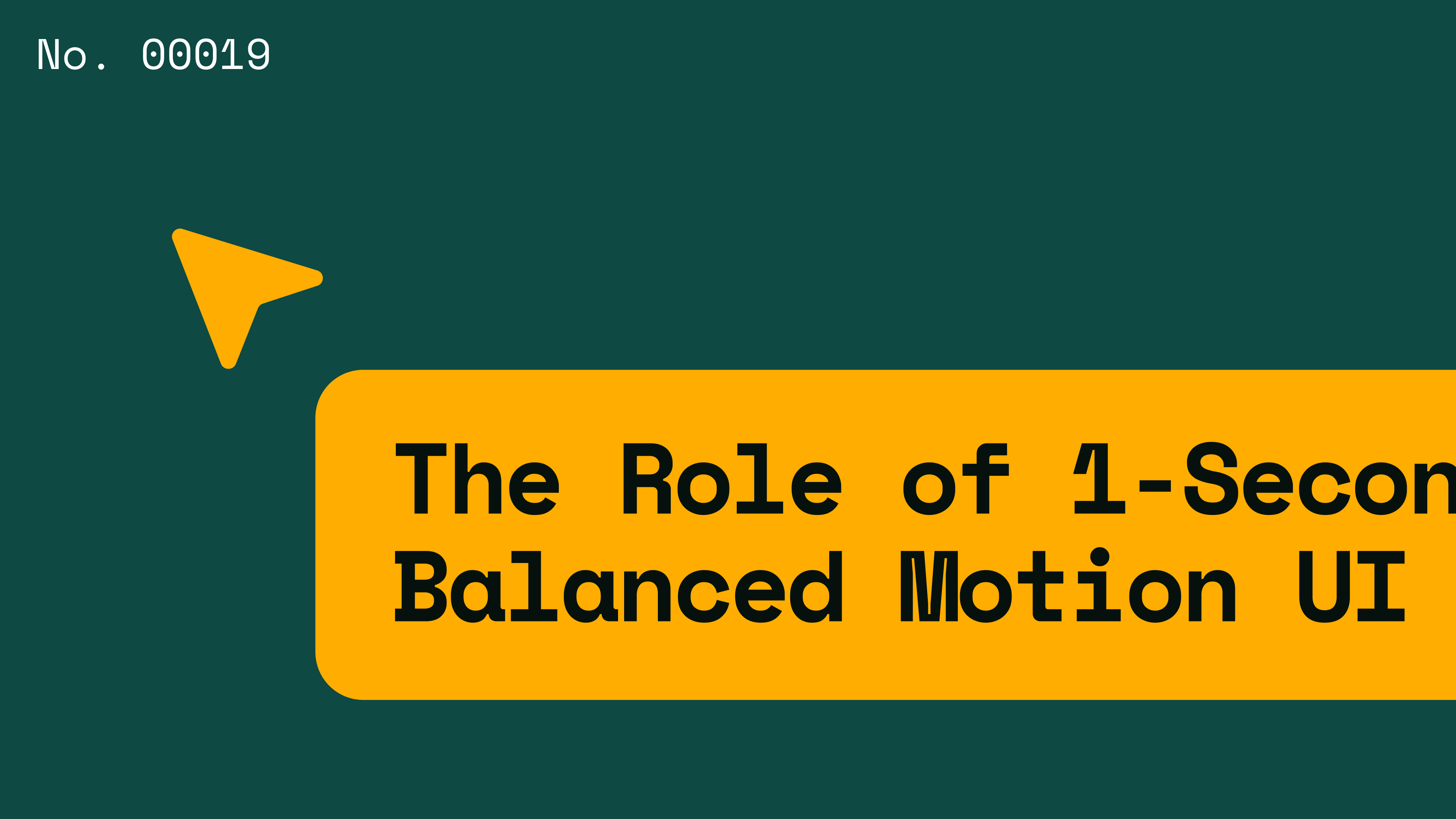
The role of 1-second timing in balanced motion UI design
Key takeaways
- Accessibility – 1-second animations give users enough time to actually process content, reducing cognitive strain without making the interface feel sluggish.
- Web optimization – Deliberate pacing keeps motion feeling intentional while leaving overall page performance intact.
- Current limitations – Slower animations only work when paired with proper easing and staggering. Without those, they just feel slow.
- Practical application – Use 1-second reveals for content-heavy interfaces, text-driven layouts, and visuals where clarity matters more than speed.
Introduction
Most UI documentation, from design teams at major companies to individual practitioners, lands on the same number: somewhere between 100ms and 300ms for motion timing. That range makes sense; it keeps interfaces feeling fast and responsive, and creates a sense of snappiness without sacrificing performance. But what happens when you want to go slower? What if a 1-second animation is actually the right call?
What 1-second timing actually does
A 1-second duration isn't arbitrary. For element reveals specifically, it does a few things that shorter durations can't:
- It gives users time to read and process content as it appears, rather than reacting to something that already happened.
- It creates pacing that feels controlled.
- It helps users track what's moving visually, so nothing catches them off guard.
That last point matters more than people give it credit for. When content enters the screen too fast, especially in text-heavy interfaces, users miss things. Not because they're not paying attention, but because the motion outpaces their ability to follow it. Slowing down to one second gives the eye somewhere to land.
Why human perception supports this
The Human Processor Model breaks down how the eye tracks motion across different speeds:
- 70ms to 700ms is the comfortable range for natural motion tracking.
- Under 70ms feels instantaneous, sometimes abrupt.
- Over 700ms moves beyond pure tracking and into something that needs more deliberate design support to work.
So a 1-second animation sits just outside that natural tracking window. That's not a flaw. It's actually where the design gets interesting.
When you extend past 700ms and introduce small delays, you're no longer just showing users motion. You're giving them time to understand it, from "I saw that move" to "I followed that and know what it means." For readable content, that distinction matters.
The cognitive side of slower motion
Here's the thing about fast animations: they're efficient, but they put work on the user. The Human Processor Model is clear that when information arrives faster than the brain can categorize it, cognitive load goes up.
A 1-second reveal works against that. It smooths out the rate at which new information hits the screen. Users can follow transitions without scrambling to catch up, which means less strain and better focus overall. The interface starts to feel like it's working with the user rather than at them.
Balancing motion and perception
Slow motion without good execution just feels broken. Perception and cognition don't operate on the same schedule. Perception is fast, almost immediate, and cognition takes a bit longer. So animations need to respect both: they have to feel responsive at the start to capture attention, then ease out to give the brain time to process the result.
Easing handles the feel. Staggering handles the sequence. Together, they're what make a 1-second animation feel considered rather than just slow. Without them, you're not designing motion, you're just delaying it.
The takeaway
1-second timing is not just a stylistic choice. It is grounded in how humans process information. The Human Processor Model shows that users need enough time to move from seeing to understanding.
By using 1-second reveals and small delays, designers can create interfaces that respect human perception and cognition. The result is a more readable, intentional, and user-friendly experience
Citations & Supporting Context:
- UX Tigers (Jakob Nielsen): Explains the Time Scales of UX, noting that 1 second is the limit for users to feel they are directly moving through a task without waiting for the computer.
- Nielsen Norman Group: Identifies the 3 Important Response-Time Limits, defining 1.0 second as the threshold for maintaining a seamless flow of thought.
Val Head: Discusses the pacing of UI animations, emphasizing that 1 second marks the boundary where a user’s focus begins to shift from the task to the delay itself.

Current chapter
table of contents
Want more like this?
Subscribe to stay in the loop.
More content
Learn about other things on our mind
.webp)