Back
2022: Building a festival site as bold as the city it reflects
CLient
engagement type
duration
status
Service
Client
About
Archtober
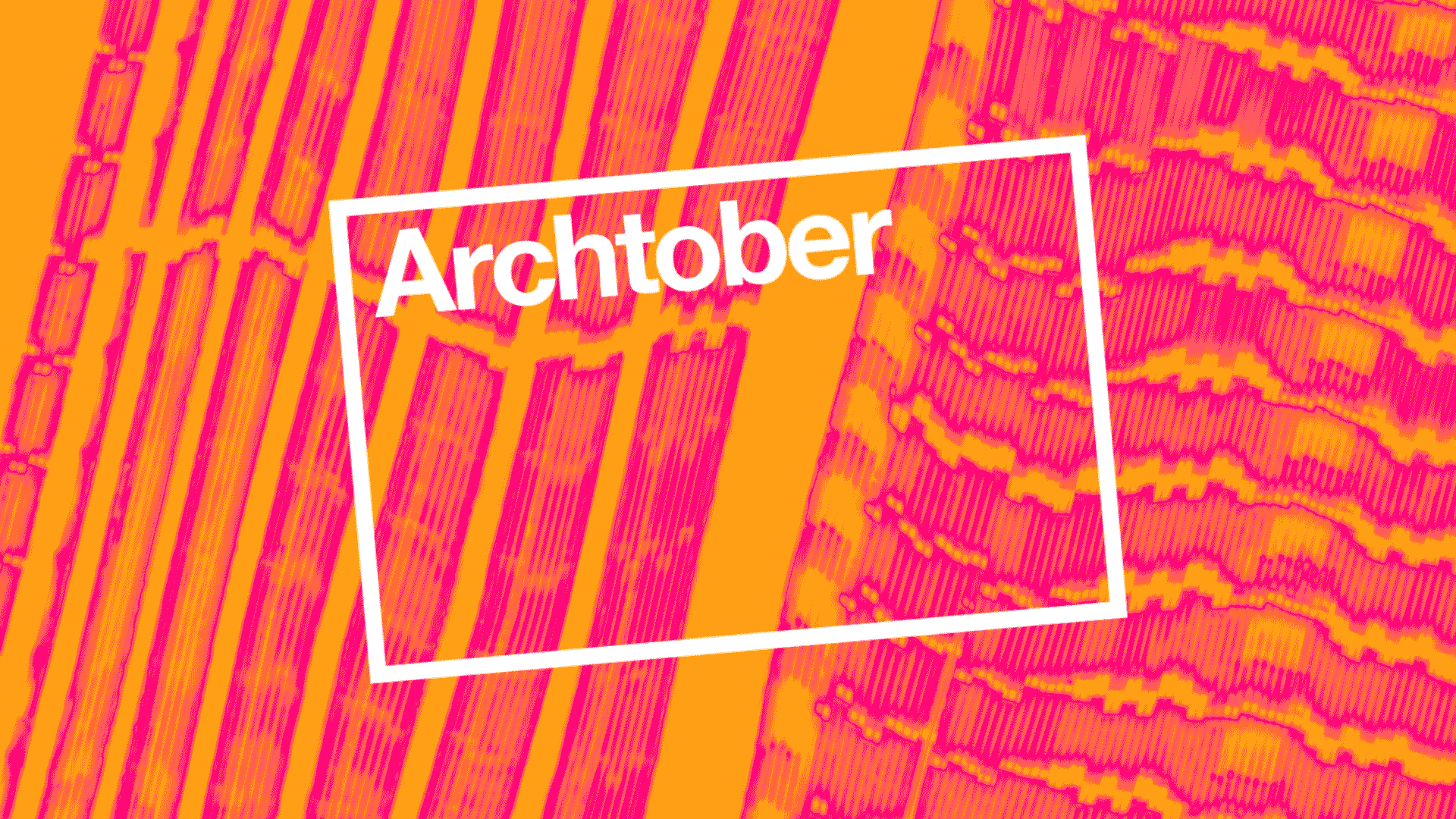
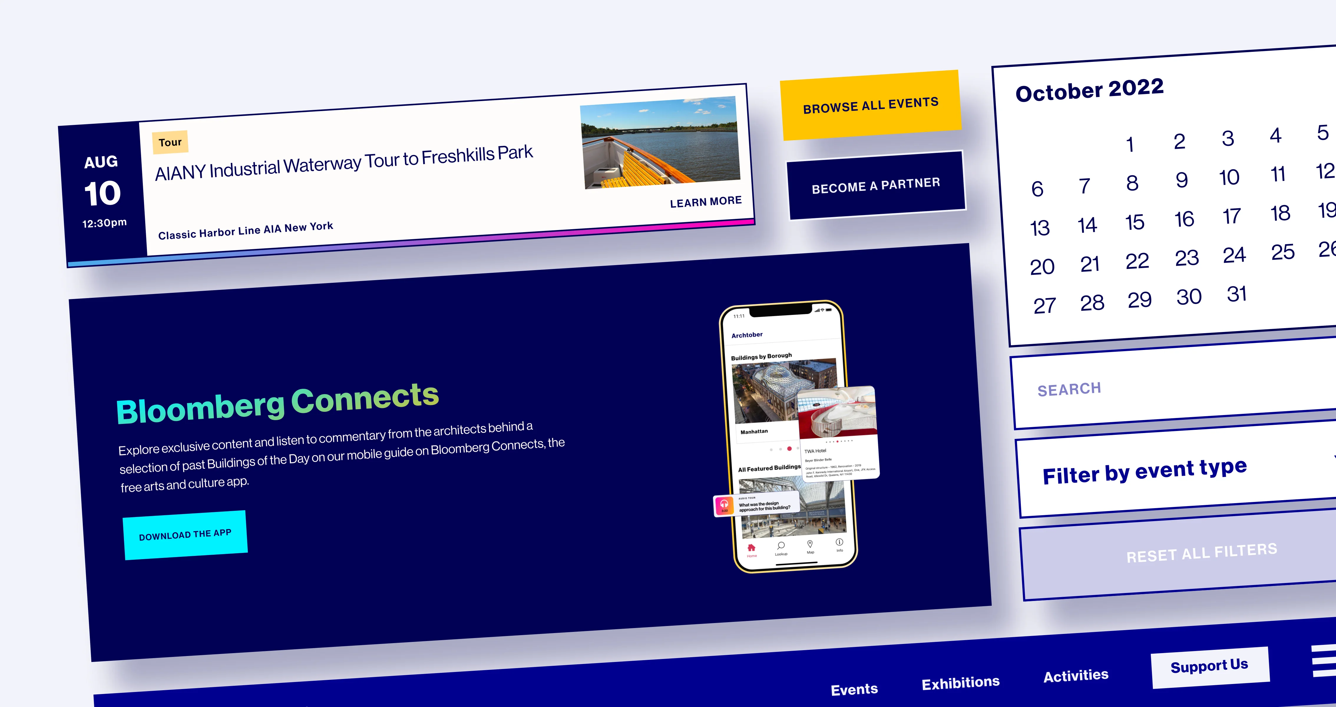
For Archtober’s 2022 festival, we collaborated with a fellow New York agency, Omnivore. They developed the brand concept, inspired by the fractured light of city window reflections, and we were tasked with expanding that brand into a design system and building their festival site experience. The brand identity proposed for this year leaned into distortion as a design language: acid glitches, bold gradients, and high contrast working together to capture distinctly urban reflections you might catch in the shiny skyscrapers. From those refracted graphics that were created, we built a design system. We added a refined and punchier color palette that still held on to the iconic Archtober yellow. We also developed a gradient language we could use on text and graphics, such as the “drop shadow” hover effect we applied to the event modules. This year, we used the logo in unique ways throughout the experience, tilting it slightly and even cropping it as a portal or window itself. The result was a bold new version of the festival site. Reskinning the site assets and events calendar with the new brand and design system, while still building off the framework we established in 2021.
.gif)