Back
2025: This Festival turned NYC into a dollhouse
CLient
engagement type
duration
status
Service
Client
About
Archtober
Overview
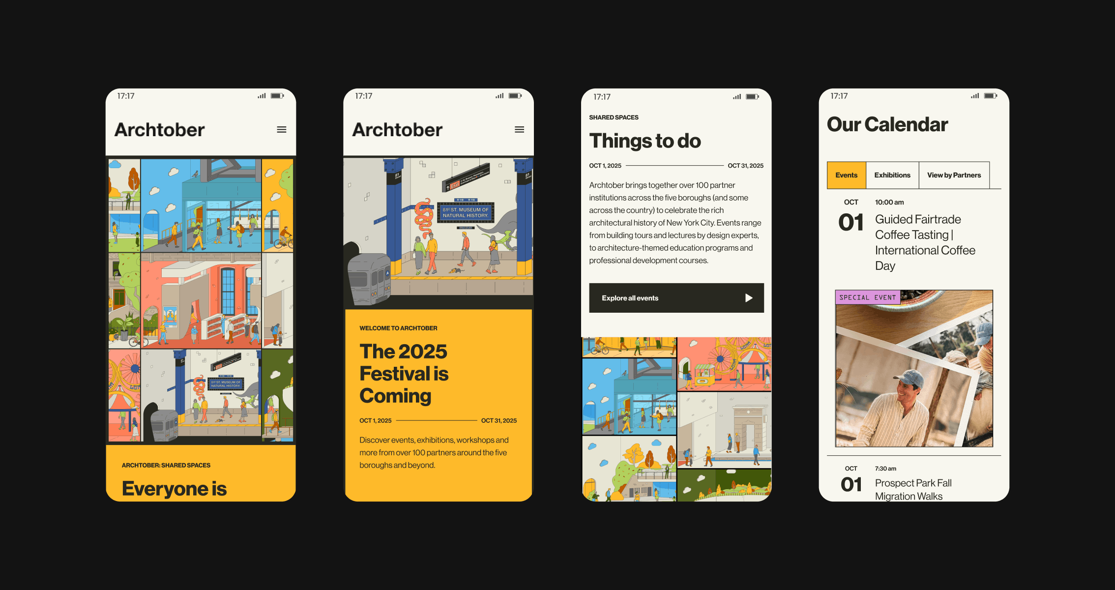
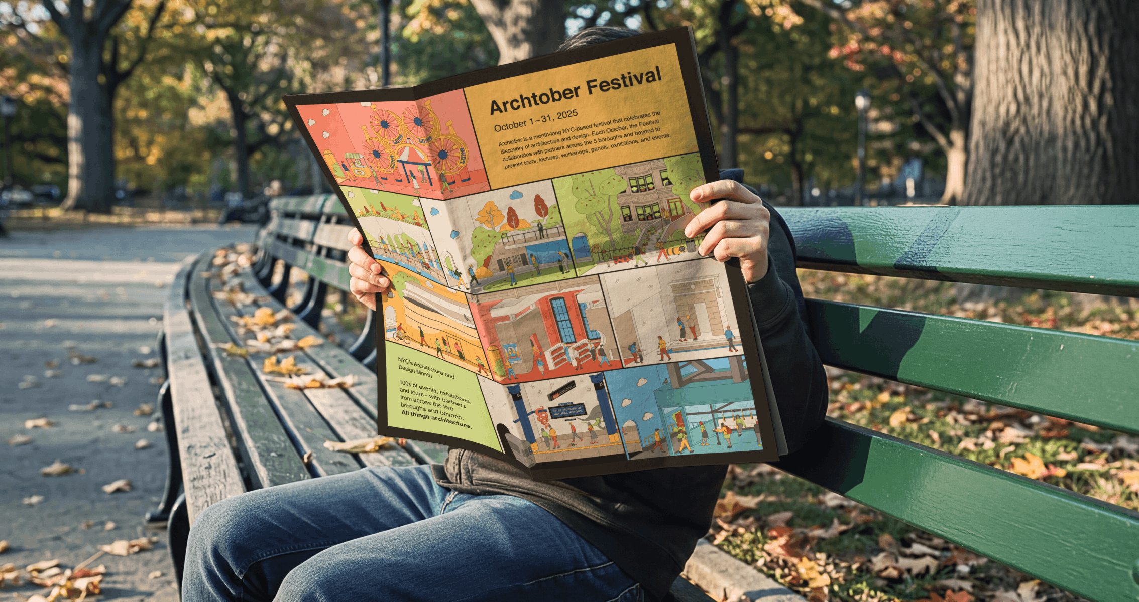
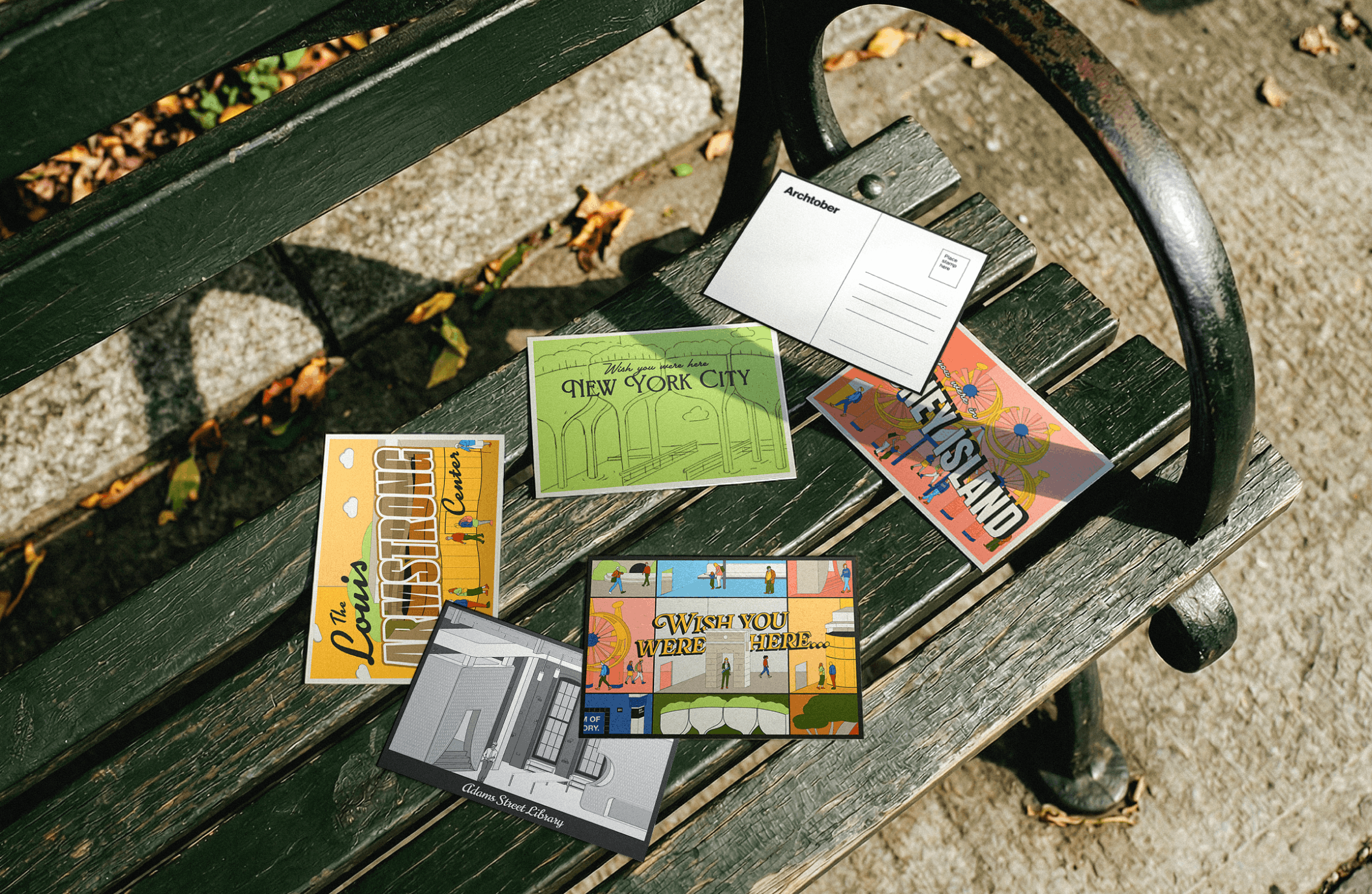
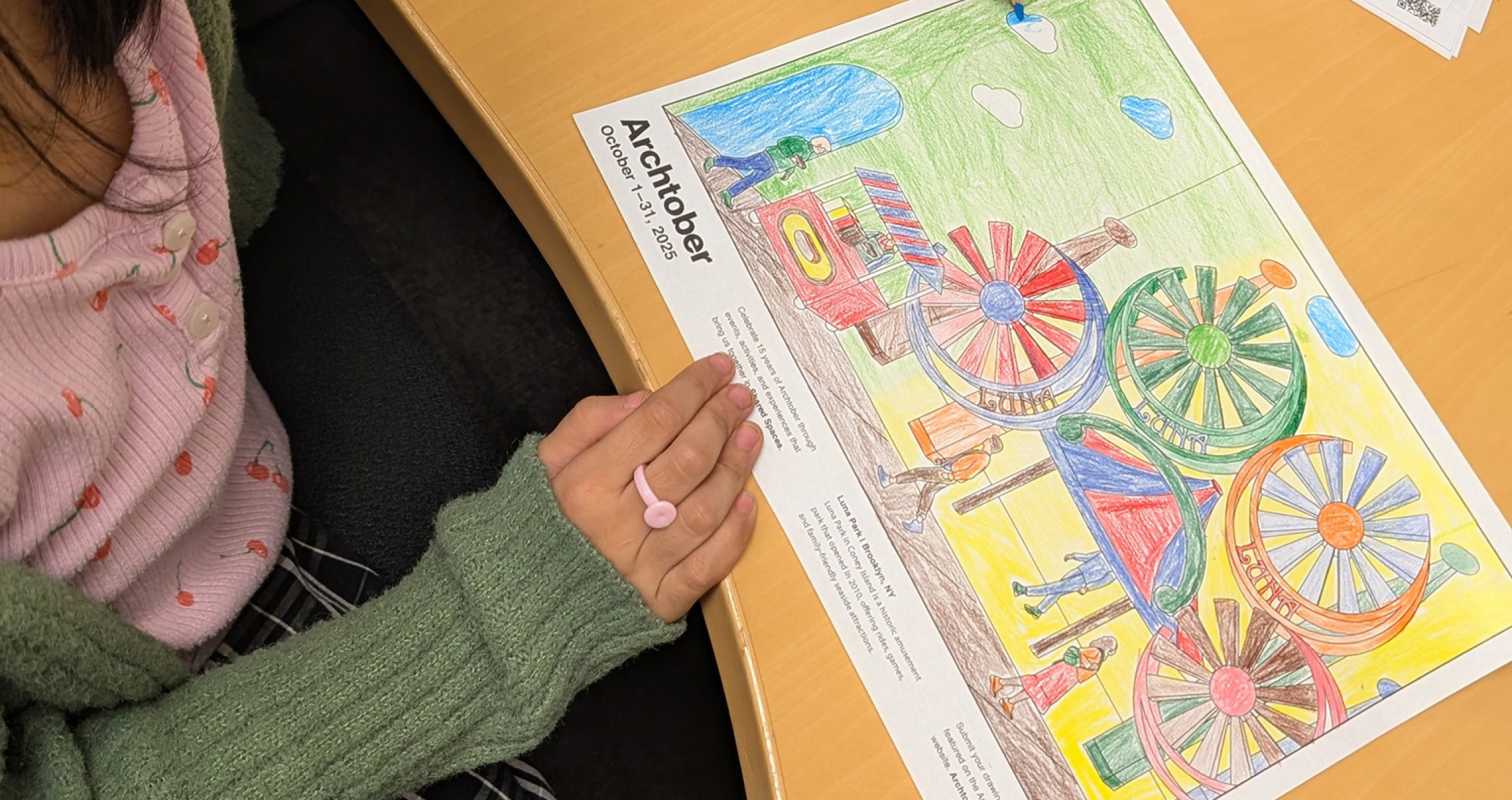
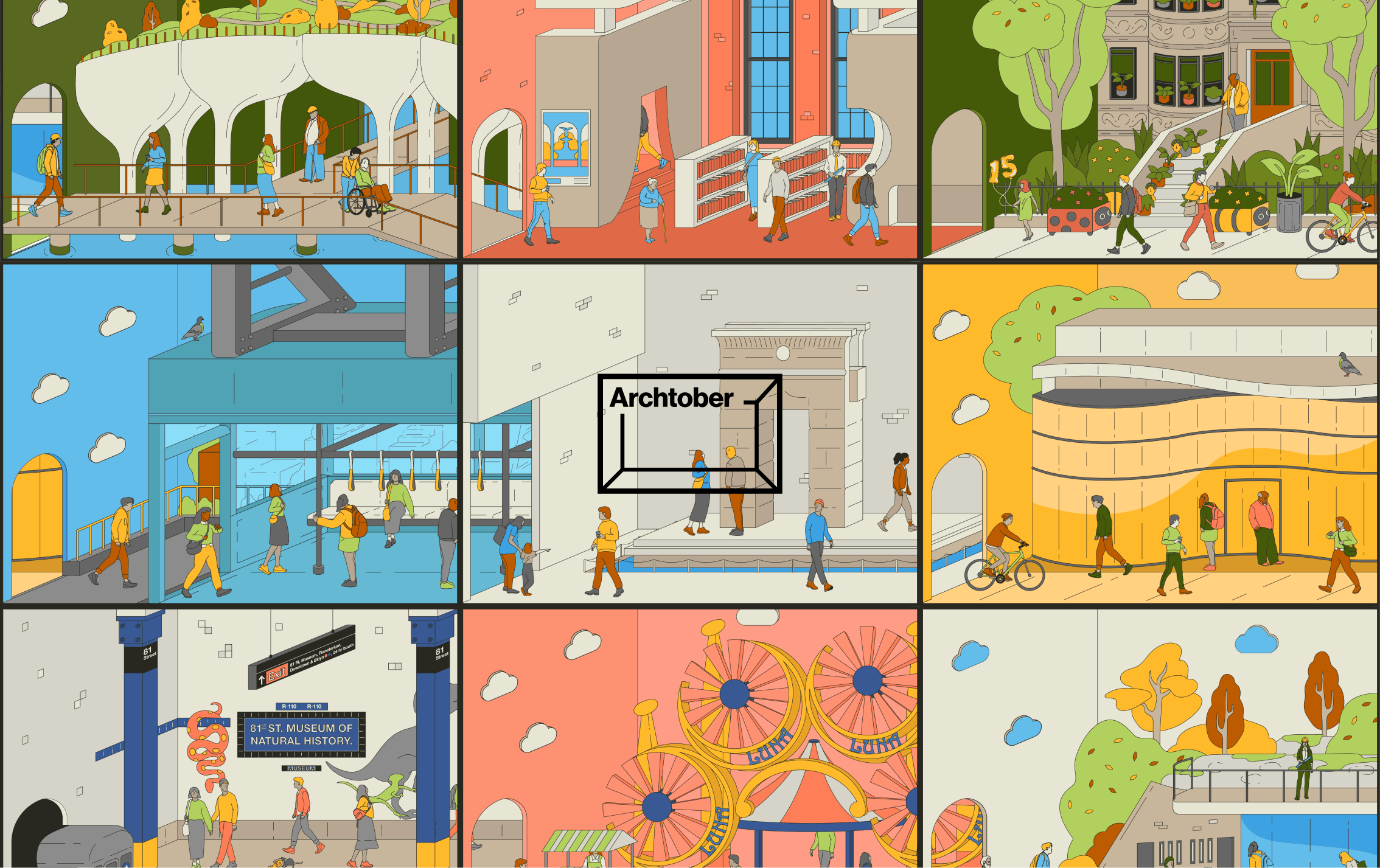
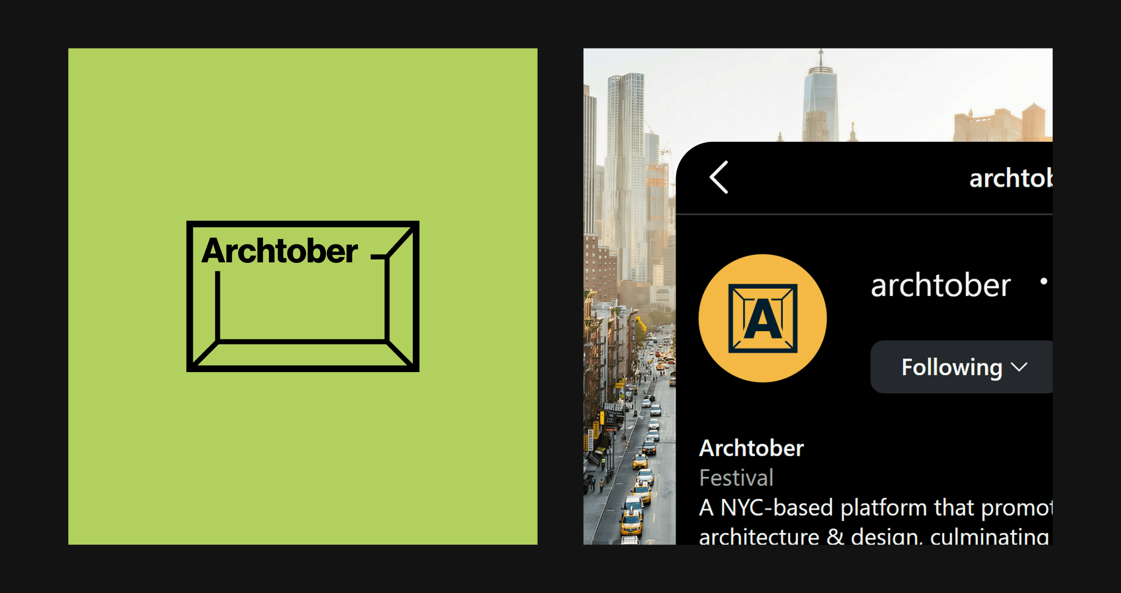
After partnering with Archtober for six years, this edition was especially meaningful as it marked the festival’s 15th anniversary. Each year, we develop a unique theme to shape the festival’s brand identity, and for this milestone, we chose “Shared Spaces.” The concept was inspired by the idea that New York City is designed to be shared, a place where diverse communities gather in parks, streets, libraries, and countless public spaces. This thinking led to a dollhouse-like illustration where every doorway opens into an iconic NYC setting, which became the foundation of the theme and informed the visual language across the website, print materials, ads, social media, and even a new offering: children-focused coloring sheets distributed to NY public libraries across the city.