Back
How human connection inspired A brandmark
CLient
engagement type
duration
status
Service
Client
About
Assemble
Overview
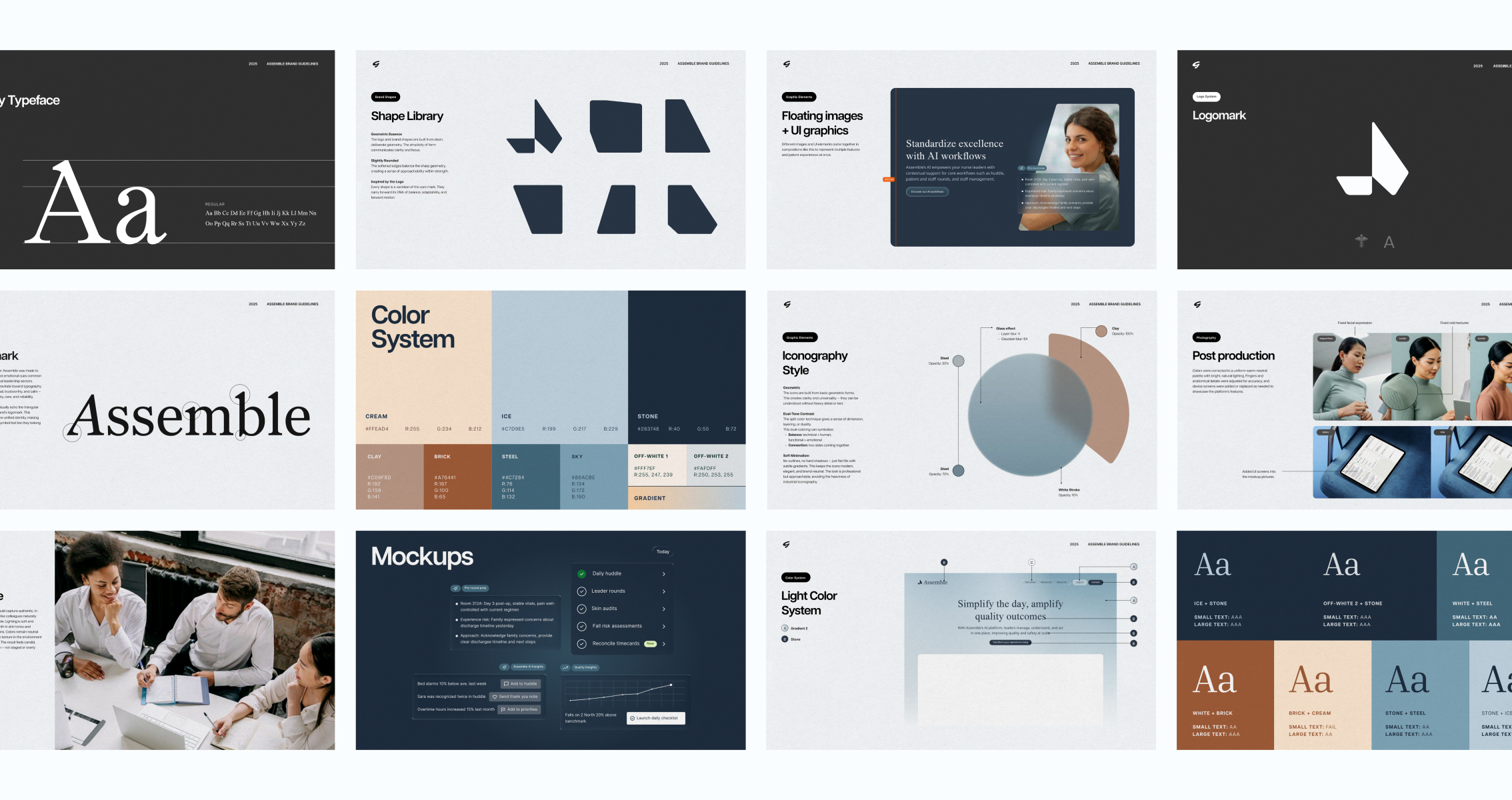
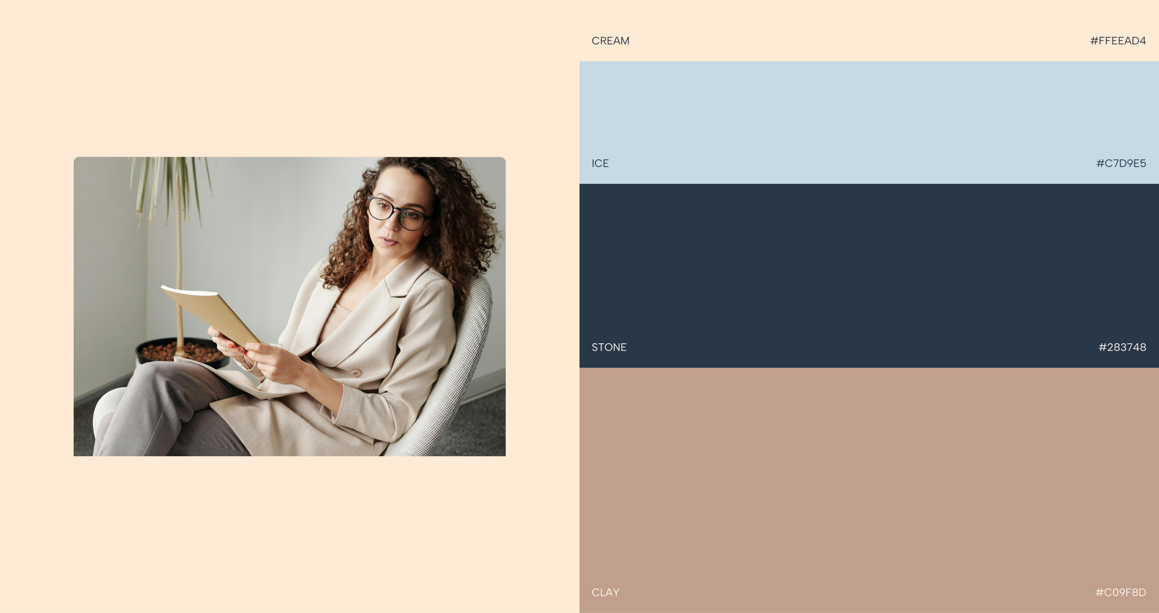
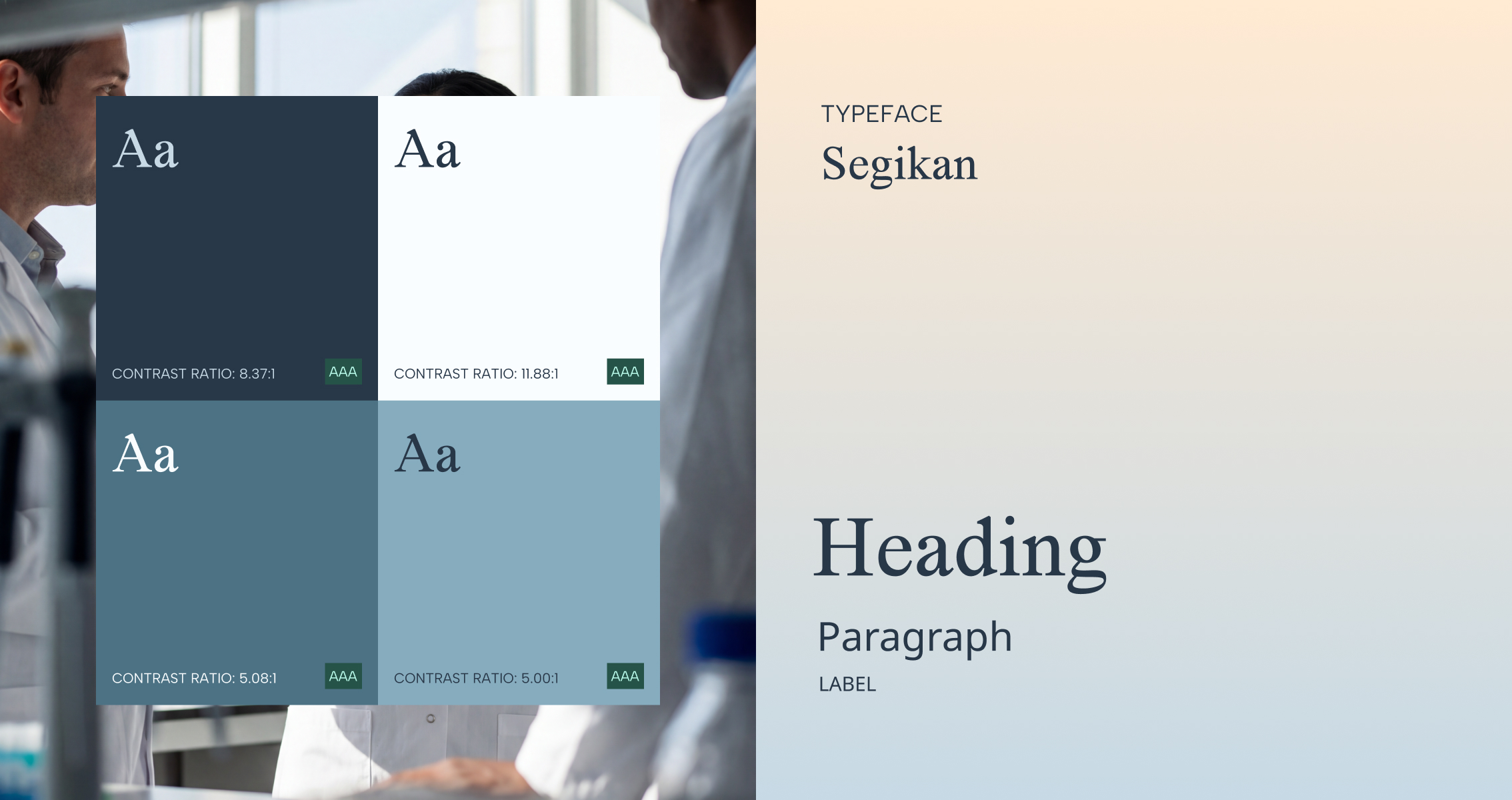
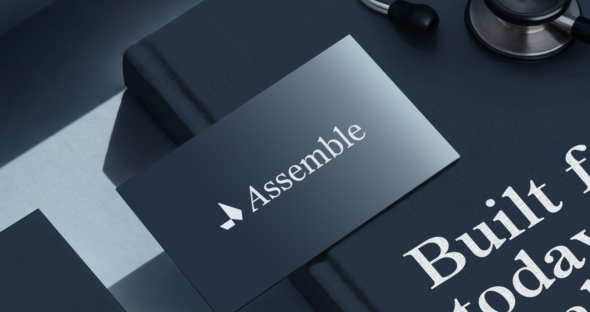
Assemble needed a complete visual identity refresh and website redesign to reflect their design positioning as a modern, tech-forward, yet human platform. Assemble's name reflects what they do: bring together leaders, teams, and data into one unified system. We took their idea of assembly literally by breaking the letter "A" into segments that could connect and recombine to form a whole. These segmented shapes became more than just a logo; they evolved into a flexible visual toolkit. The same forms that built the mark could be recombined to frame photography, structure layouts, and generate graphic patterns across any touchpoint. When we translated the identity to the web, we leaned into a tech-forward aesthetic with glass effects, transparency layers, and thoughtful animations that felt modern without losing warmth. The result wasn't just a brand, it was a scalable system with built-in flexibility, ready to grow and adapt as Assemble evolves.