Back
2026: This festival was drawn by hand, one shape at a time
CLient
engagement type
duration
status
Service
Client
About
Archtober
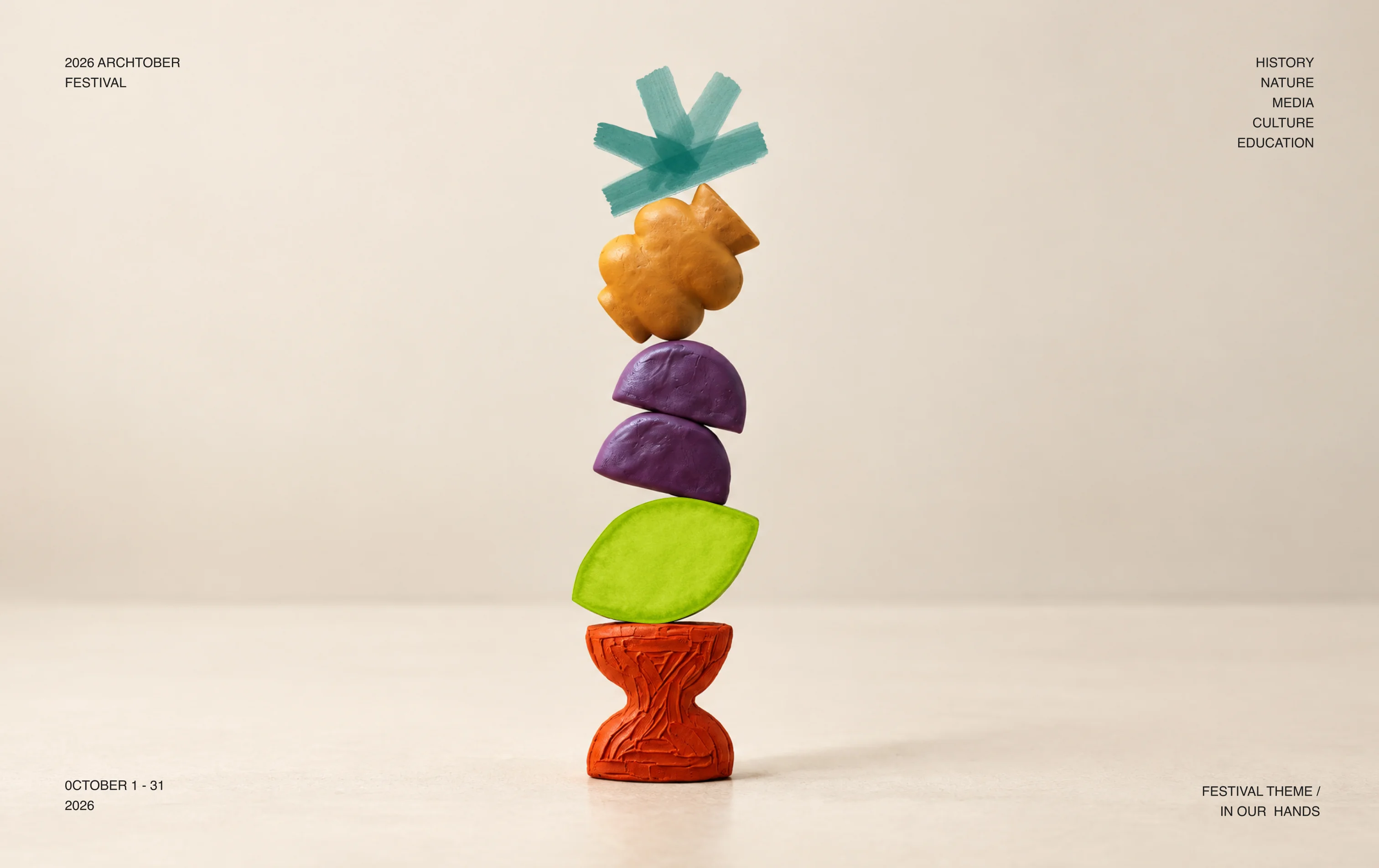
For our 7th year of partnership with Archtober, this year's theme was "In Our Hands" which calls for togetherness amid crisis; a grounded response to climate change, technological disruption, and divisive policies. The festival celebrates sensorial and inclusive design, handcrafted practices, and resilient structures, that come to life not only in the event programming but the visual identity as well.
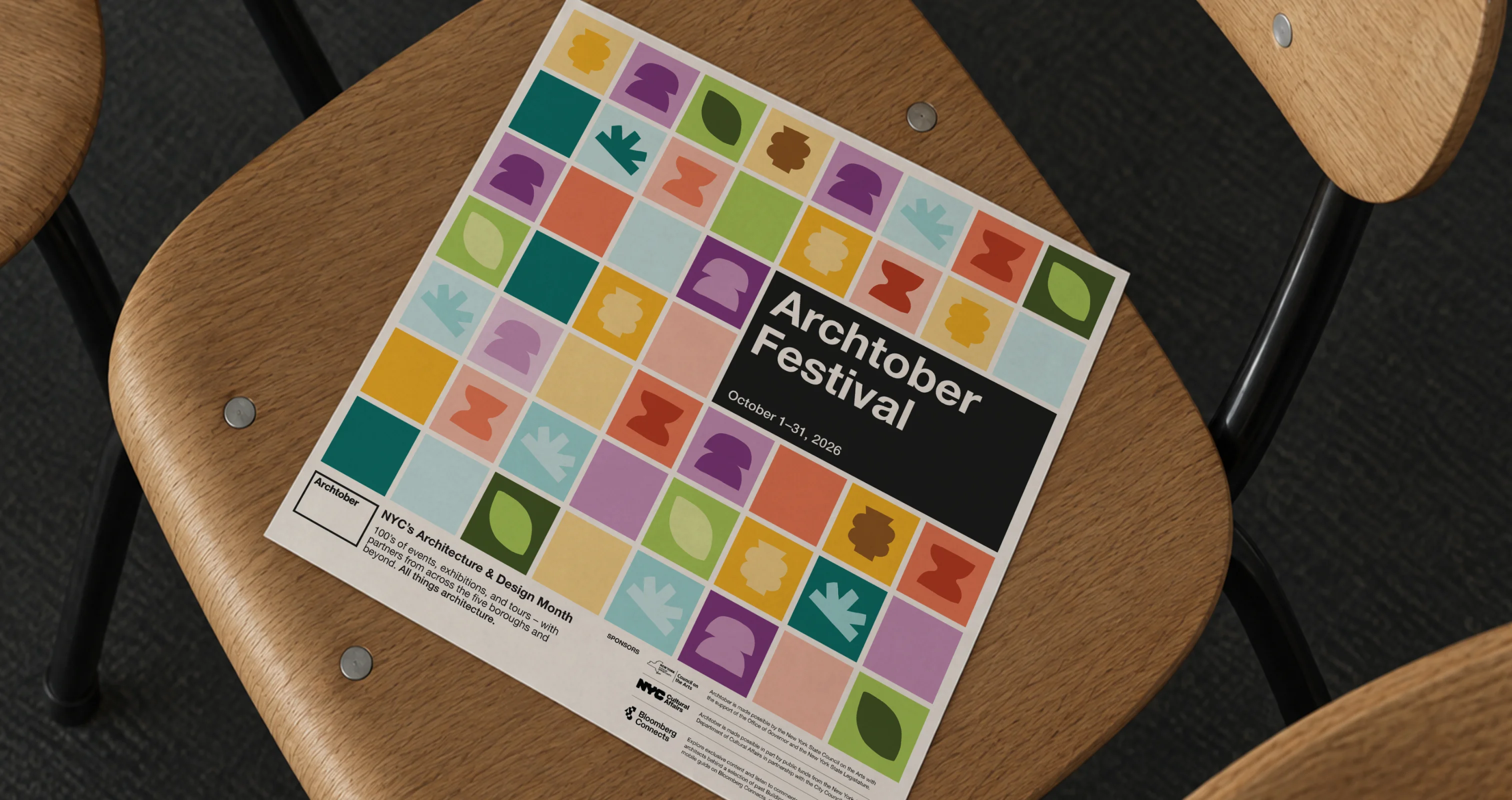
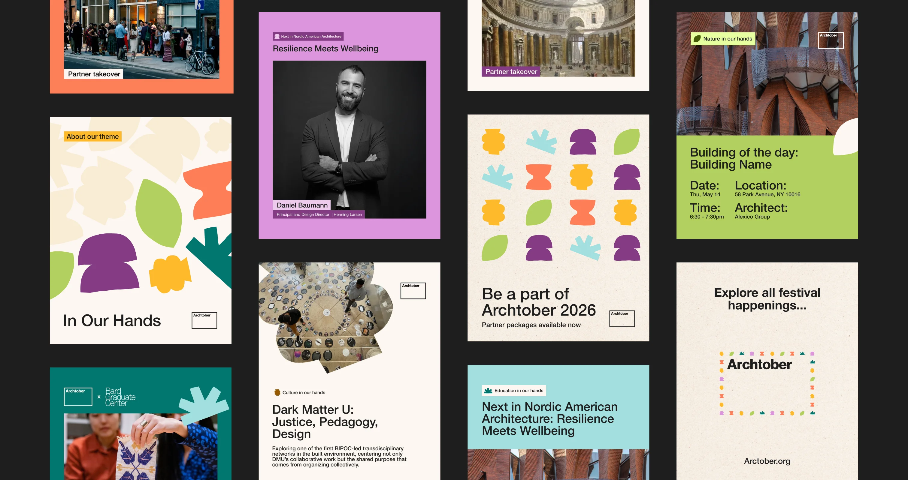
For this festival, we created a visual brand system centered on five organic shapes, one for each festival topic: Nature, Media, Culture, History, and Education. Each shape has its own color and texture. We used a hand drawn style and classic art media like clay, colored pencil, and paint
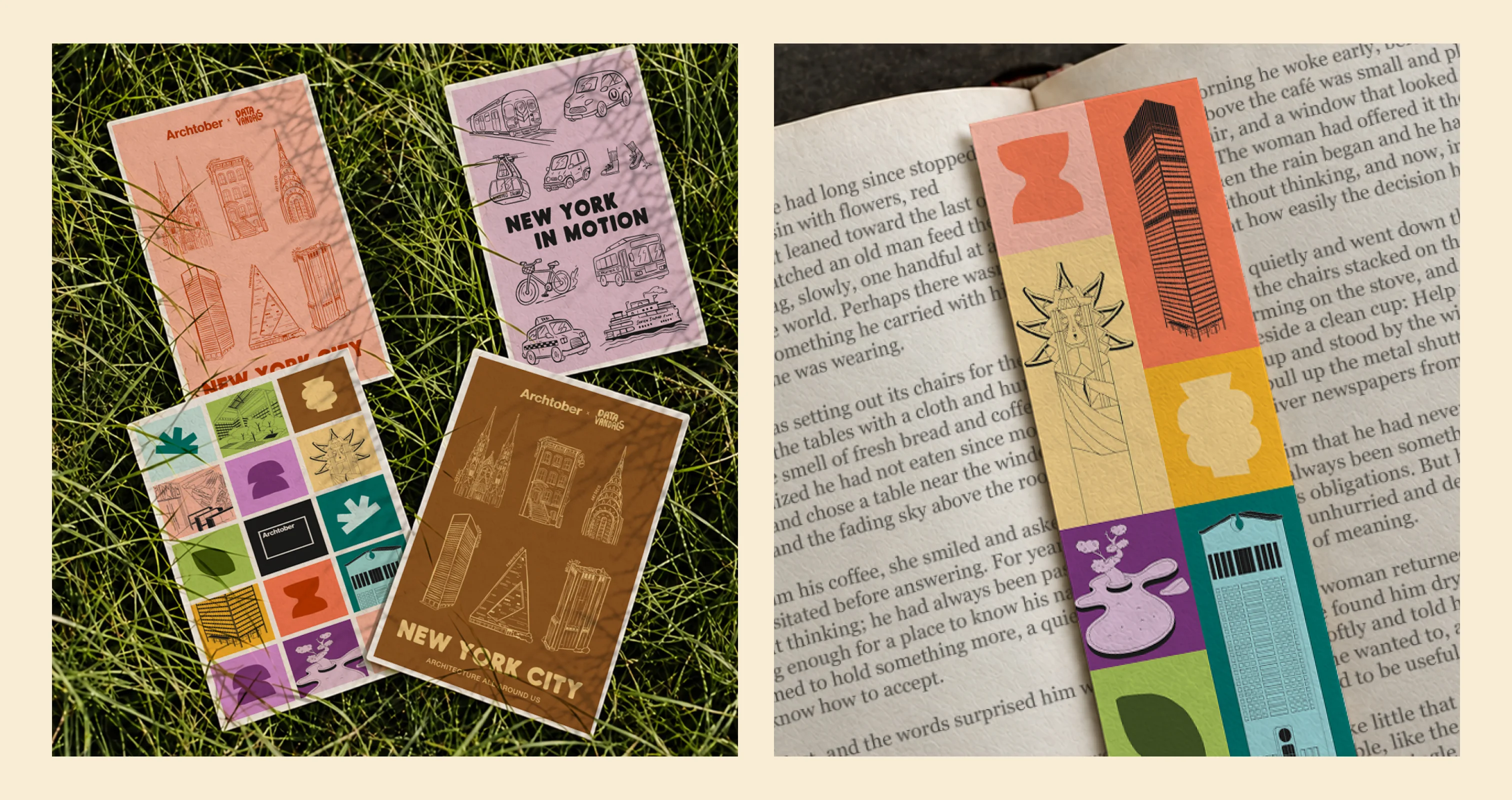
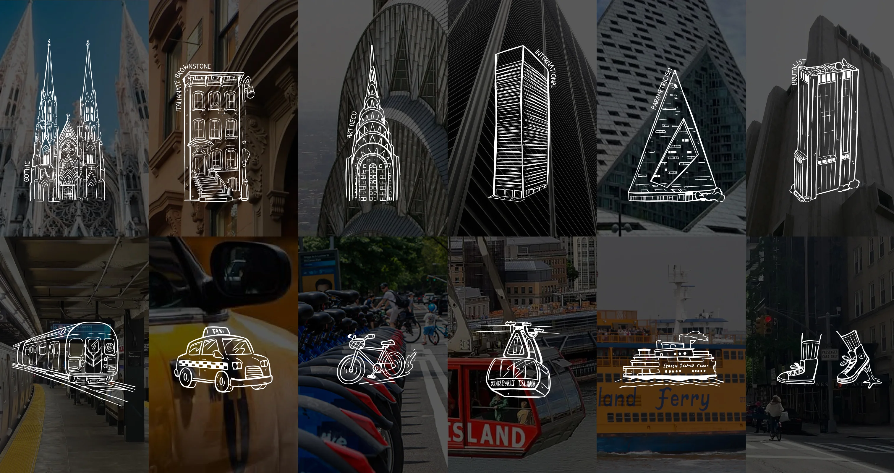
The system was designed to work at every scale: on the website and social feeds, across prints and bookmarks, a NYT insert, on festival merch, masked over photography, layered as patterns, and even architectural illustrations of iconic NYC buildings.
This year’s festival features an interactive installation for the first time: a subway newsstand takeover at the 51st Street 6 train downtown platform, in partnership with Data Vandals. The activation invites riders to explore NYC’s steam system and the invisible networks that shape the city above and below ground, and features interactive panels for a collaborative learning experience. The visuals we designed merged Data Vandals’ style with Archtober’s visual identity, so each brand kept its own identity while working together. From first conversation to installation, the whole activation came together in under a month.