Article
Before the Prompt: Why AI-Generated Images Still Feel Like Stock
Key takeaways
- The generic trap: AI democratization has made generic, stock-like images easier to produce, making it harder for brands to stand out.
- Context is king: Effective AI imagery requires intentional details like specific props and lighting that reflect the user's actual environment.
- Beyond the prompt: Standing out requires creative direction and brand-specific assets layered into AI environments, not just the ability to generate something.
There's a scene in The Secret Life of Walter Mitty where the main character finally tracks down a legendary photographer, after crossing desolate terrain and the remote edges of the world, only to find him crouched on a mountaintop, waiting. A rare snow leopard finally appears.
Walter urges him to shoot. The photographer doesn't move. He lowers the camera and says something like: when something truly moves you, a lens can't always capture it.
This isn't really about a great movie, though it is one
As consumers, we're surrounded by commercial images every day. Ads, websites, apps, brand assets, packaging. If I asked you right now which one you actually remember from the past two weeks, could you answer? Most people can't.
Part of a graphic designer's job is creating images that support a brand's story, including AI-generated ones. Something I've noticed over time: most commercial images, whether stock or AI-generated, feel identical. Stock photography made quality images accessible to smaller brands. AI took that further, giving anyone the ability to generate something custom in seconds. But even with that freedom, the results often feel just as generic as before.
The democratization of image creation didn't make images more interesting, it just made generic images easier to produce at scale.
A forgettable image forces everything around it to work harder: the copy, the layout, the design. A good image does that work on its own.
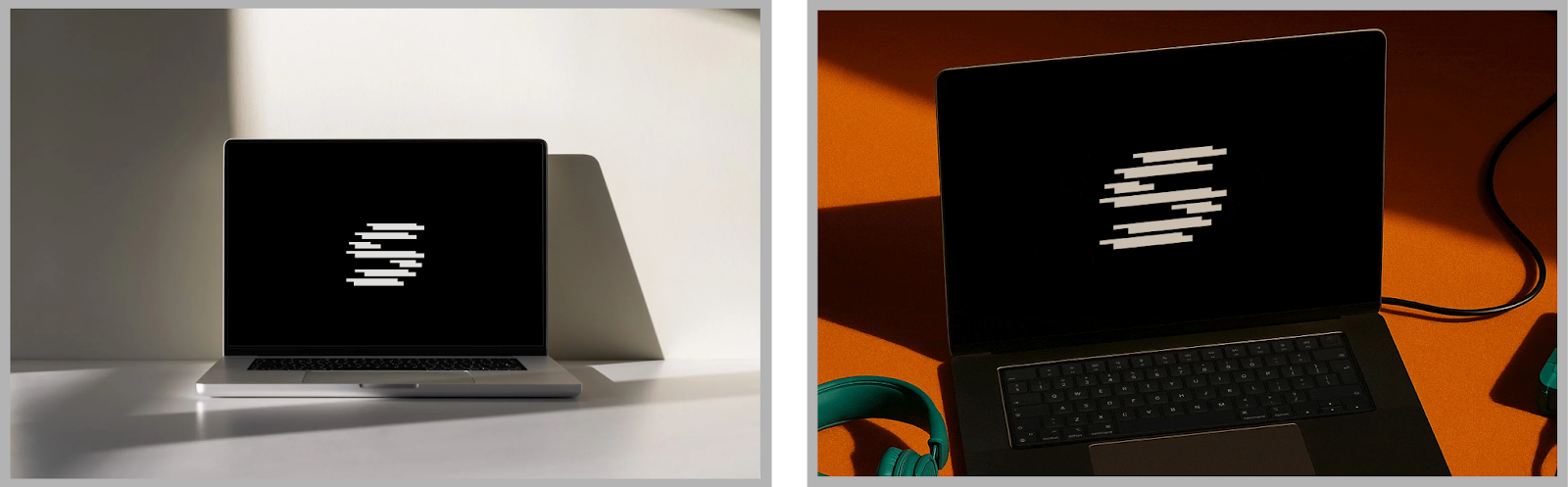
The generic mockup
Search "laptop mockup" and you get hundreds of thousands of results. White backgrounds. Clean surfaces. Perfect lighting. You pick one because it doesn't belong to any brand in particular. Prompt an AI with the same idea, and the output looks almost identical.
Now think about what that laptop actually means for the brand you're working with. What does their world look and feel like? What details live there?
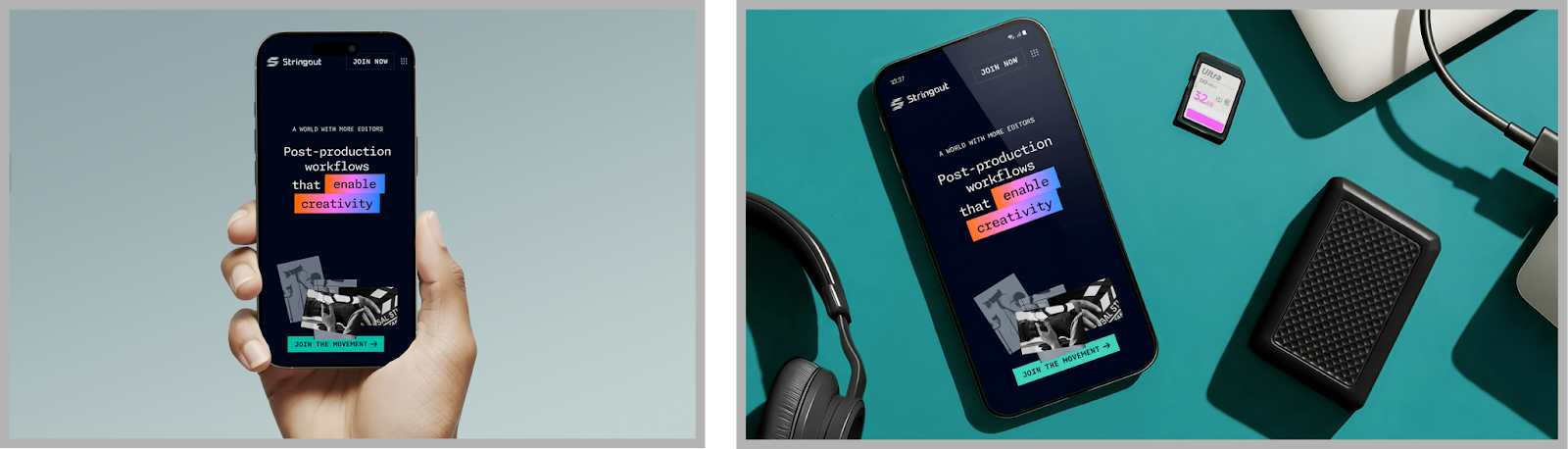
For Stringout, a post-production workflow tool built for video editors, a generic laptop on a white desk would have said absolutely nothing. Stringout's identity was built around a specific idea: that AI should free editors, not replace them. The brand drew from the visual language of the editing timeline, the rectangles, the gradients, and the color palettes editors recognize at a glance. The images needed to live in that same world, so the visuals included dark surfaces and dramatic lighting that mimicked a real post-production suite, contextual props like SD cards and cables sitting off to the side, familiar UI elements, gradients, and palettes pulled straight from editing timelines. Nothing in those images could have come from a Google search for "laptop mockup."
When the environment is part of the message
FutureCard needed ads for New Yorkers riding the subway, but our brief wasn't just "subway ads." It was about stopping a commuter in one of the most visually saturated environments on earth.
To document our work, a clean product shot wasn't going to do it. Custom illustrations were composited into an AI-generated subway environment, grounding the visuals in the space that actually hosted the campaign.
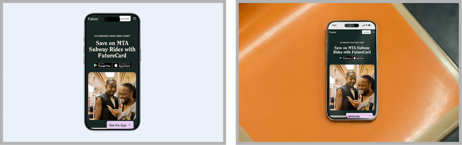
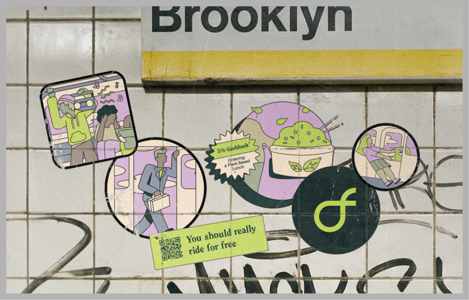
The goal is always to make a generated image feel as real and contextual as possible by placing it within the actual world where the campaign lives. To make it feel ownable, brand-specific assets get layered in.
The takeaway
In both cases, the difference wasn't the tool; it was the direction behind it. Just like Walter Mitty's photographer understood that preserving the most memorable moments requires more than pointing a camera, working with AI-generated images requires more than writing a prompt. The tool gives you access; what you do with that access is the actual job.
Generating an image isn't the hard part anymore; even kids do it now. The real question is whether the image connects with the brand, reflects what it's trying to say, and brings something to the table that couldn't have come from a stock search.
The brands that stand out aren't generating the most images, they're the ones putting real intention behind every single one.
Current chapter
table of contents
Want more like this?
Subscribe to stay in the loop.
More content
Learn about other things on our mind