Article
Moving to the scale-up stage as a consumer app: Rebranding is basically unavoidable
Startups are built to move fast. The whole point, at least early on, is to validate whether a product actually solves a real problem, find the people who need it, and build something worth scaling. Profitability can wait, as venture capital fills the gap.
And the brand? That usually gets duct-taped together by whoever has a few hours to spare. That's just the reality of what early-stage companies are working with. When resources are tight and the team is small, branding is DIY by necessity. A name, a logo, a handful of colors, maybe a font someone found on Google Fonts. That's enough to get a landing page up, start collecting signups, and get the first wave of early adopters through the door. Most of those assets are open source, which means they're not particularly ownable. But ownable branding isn't the priority yet; shipping is.
Key takeaways
- Strategic shift: Rebranding signals a transition from product-market fit validation to rapid, sustainable growth.
- Operational signal: A new brand identity communicates a clear understanding of what the product does and where it's going.
- Building trust in AI: Modern rebrands lean into tactile, organic, and energetic visuals to make abstract AI features feel more human and approachable.
- Speed vs. perfection: Scale-ups should prioritize incremental brand improvements rather than bottlenecking their ability to ship.
Once a startup hits the scale-up stage, the focus shifts. Experimentation gives way to execution. The question stops being "does this work?" and starts being "how do we grow this consistently?" That shift almost always calls for a rebrand.
And this is exactly where having a brand that's actually yours starts to matter. Not a new logo for the sake of having a new logo. A rebrand at this stage is a signal to users, investors, and the market that the company understands what its product does and has a plan for where it's going next.
What a rebrand actually does
Done well, a rebrand doesn't just change how a company looks. It changes how the company lands with people.
A few things a strong rebrand accomplishes:
- Reaching a wider audience: A polished, professional identity builds trust with people who weren't paying attention before.
- Expressing a clearer purpose: Color, typography, and photography can all do heavy lifting when it comes to communicating what a company has become, not just what it started as.
- Scaling the asset system: Good brand design creates tools, not just visuals. The assets should work harder as the company grows.
- Building a fuller sensory experience: 3D motion, sonic branding, texture, these aren't decorative extras. They signal real investment in how the product feels to use.
Recent examples worth looking at
Granola
Granola AI rebranded in February 2026, shifting from positioning itself as a quiet note-taking app to something more active: an AI that lives inside team meetings and helps drive actions and follow-ups.
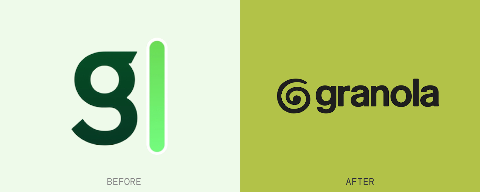
The shift is pretty visible. The old brand felt clinical and digital. The new one feels like it belongs in the room with you.
Lovable
Formerly GPT Engineer, Lovable rebranded in December 2024. The name change alone tells most of the story: from a tool built for developers who understand what GPT means, to a product inviting anyone to build apps. The rebrand reflected a commitment to making app development accessible to people who aren't engineers.
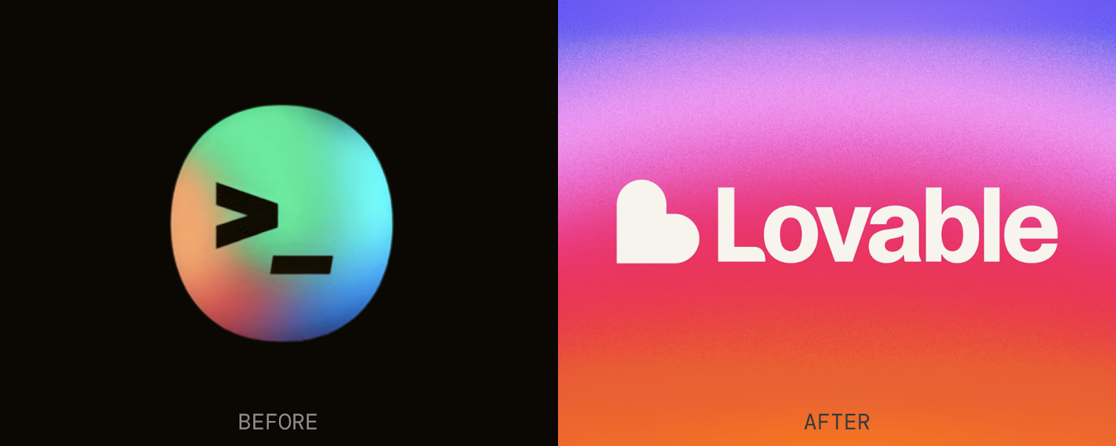
Going from grayscale tech aesthetics to pink-blue gradients and a heart logo is a big swing. But it's a deliberate one.
Arena
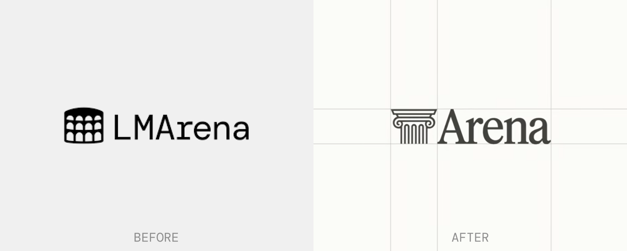
On January 28, 2026, LMArena (formerly Chatbot Arena) officially rebranded to Arena. This change marks the platform's evolution from a research project focused solely on Language Models (LMs) to a comprehensive evaluation platform that allows users to test and compare which AI models give better results.
A response to the zeitgeist
All three of these rebrands are responding to the same underlying pressure: AI adoption. In today’s landscape, products embed artificial intelligence as a core feature and differentiator. In this effort, you're asking users to trust something abstract and often misunderstood. That's a harder sell than it looks.
What you can see across these examples is a consistent move away from cold, technical aesthetics toward something warmer and more physical: bold colors, organic shapes, tactile textures, and sound design – things that feel human rather than algorithmic. The goal is to make users feel like the AI is working with them, not at them. At the end of the day, the goal is growth, and growth requires trust.
Does your company actually need all of this?
Probably not all of it. Not right now, anyway.
The logo-versus-brand debate gets settled pretty quickly once you start digging into it, and the answer is obvious: a logo alone isn't a brand. But going the other direction and treating a full rebrand as a checklist to complete before you can do anything else, that's just as dangerous. Slowing down your ability to ship in order to perfect your visual identity is a bad trade at almost any stage.
The companies winning right now are the ones who can ship fast, and iterate. Brand work that creates approval loops and halts production is working against that.
At Greater, we think about this differently. We favor incremental brand improvements as a more sustainable path, and we've built a framework that ends approval bottlenecks entirely, so your brand can evolve without grinding everything else to a halt.
A rebrand built on solid foundational elements can flex as the company grows. It can be stretched, simplified, adapted, and applied across contexts without losing coherence. That's what you're actually building toward: a brand that scales with you rather than one you have to rebuild every time the product changes.

table of contents
Want more like this?
Subscribe to stay in the loop.
More content
Learn about other things on our mind
.webp)